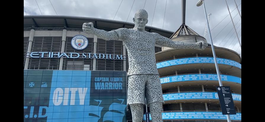
I chose this photo that I took to work on, because firstly, I really like it. Secondly, I feel as though it can be greatly improved with the right editing. I have decided to edit two separate versions of the same image, as I cannot decide which version I prefer.
Here is the original raw photo:
After: With this version, I wanted to make what was quite an overcast day seem a bit brighter and more vibrant. By increasing the contrast and the saturation ever so slightly, I was able to make the blue in the background stand out significantly more. I also cropped out the sign in the bottom right of the original image. I feel as though the vibrant blue helps to make the writing in the background stand out, which I think makes the image more potent.
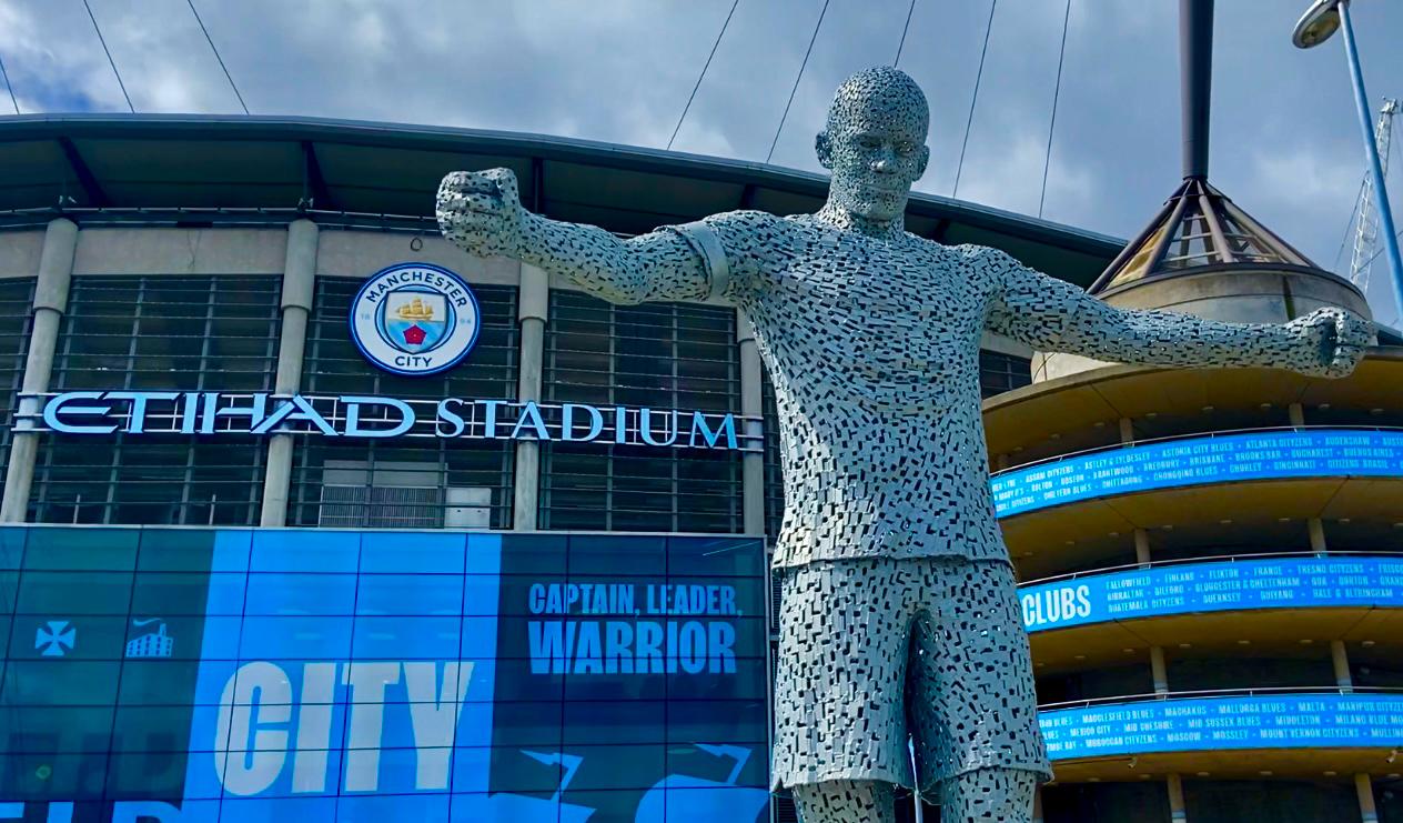
After: For this edited version of my photo, I decided that quite a dark tone would make the image look really good, and rather ominous. The pose of the statue, and the clouds in the sky almost make it seem like quite a powerful and intimidating photo. However, I also wanted to try and keep some of the sky blue in the background shining through, which I think I managed fairly well. Overall, I think I prefer this version of the photo, as it suits the pose of the statue better, and gives the viewer the desired viewpoint. I started by again, cropping the sign and I then added shadows and highlights to the image to give it darker tones. I increased contrast and exposure slightly in order to punch the blue through a little bit. I then added a little bit more shadowing to the edges of the image to give that dark effect.


You must be logged in to post a comment.