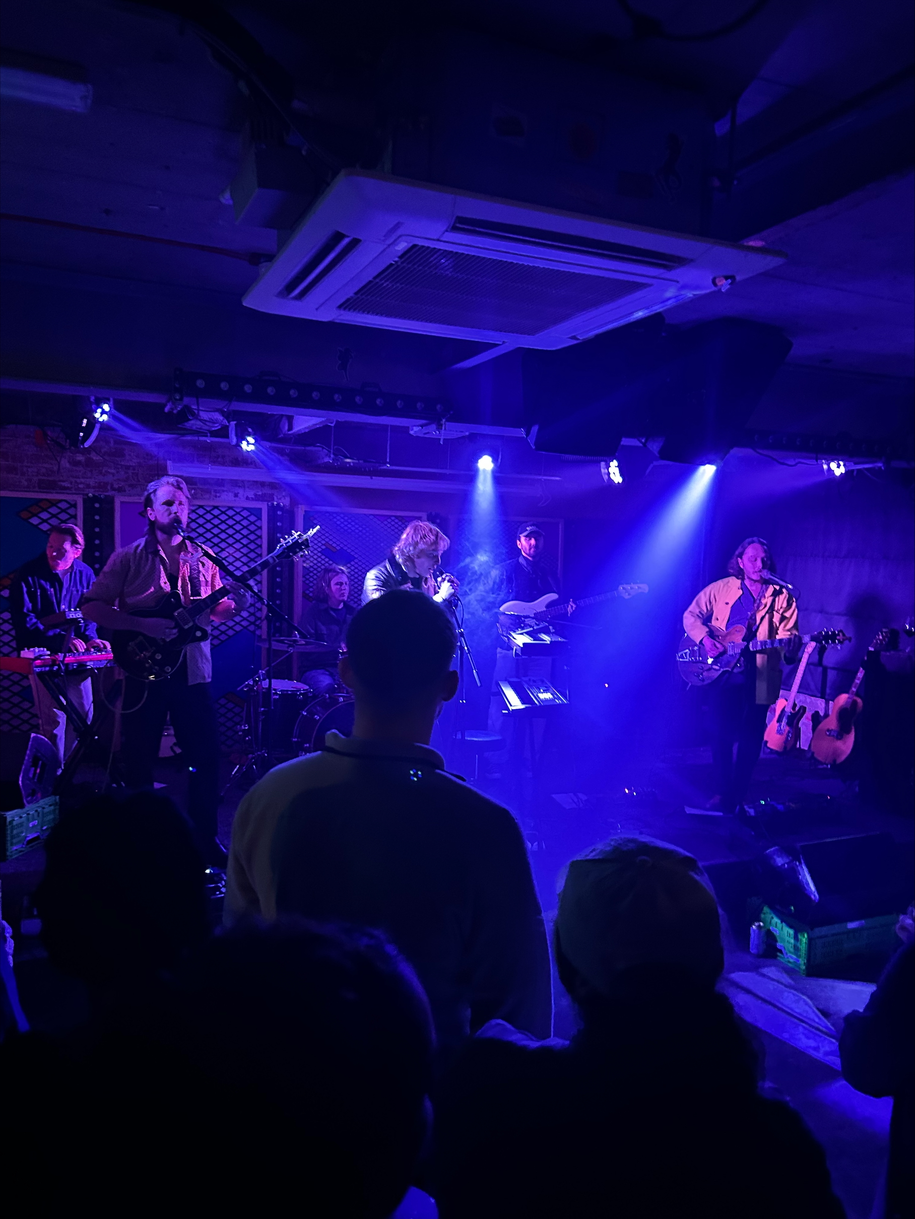
This is the photo that first went into Photoshop. It is from a gig I recently went to, the quality isn’t awful but some of the bandmates are a bit blurry and the saturation of the blue might be off putting to some. Generally, I think the quality of this photo could be improved.

This is the edited version. The bandmates stand out more I think, the picture is easier on the eye and there is a softness of the image that I think helps it. This was achieved by heightening the hue and the saturation of the image, with little adjustment to the lighting. Then I moved onto colour balance and increased the levels of the reds and greens in the image to counteract the overwhelming blue.

This is a photo of a collapsed building on Kirkgate. I think the atmosphere of the photo does well to convey a gothic aura which could be beneficial in putting across a haunted, abandoned feel. I think playing around with darker lightings and accentuating different colours could help to perhaps repurpose the image and generally get to a higher standard.

I found that over editing this image was highly likely and any great change would have taken away from the original image. The only change I really made was massively heightening the vibrance which I think helps to make the building stand out and I think the sky looks better too. While I would like to make it slightly more gothic (which I think I would need more experience with Photoshop to achieve) I have still improved the image overall which was a goal of mine.

The image here is of a statue in a quiet square so any kind of improvement that will drastically change the image will be hard to achieve but, again, just playing around in Photoshop and seeing what can be changed may uncover something in the photo which makes it much better.

Just be heightening the saturation, I think the picture has a richness that it didn’t before. Also, by cropping it to a ratio of 16:9 (which I have used for each of the images) I think the statue is now centre stage, which I think would be ideal for advertisement purposes.

You must be logged in to post a comment.