BEFORE TAKEN IMAGES
As I have chosen the topic of murals/artwork. It is important I try and get the best images possible to fully show how good the artwork is. One of the things I have thought about is angles and where I should take the photographs from. After speaking to Karl and looking at other images taken of murals it seems that a good idea to do is take them square on and centre them if possible depending on what the piece of work is.
Also I have to go on a day where it isn’t too dull so I can have some light to work with when taking images as well. This will help when it comes to taking the images with different settings as I will have more room to play around with.
I plan on taking images with different f-stop settings as well, mainly using lower settings to try and get that shallow depth of field look that really shows the focus on the chosen piece of artwork.
AFTER IMAGES TAKEN
My images have been taken and now edited as well, it took me around 2-3 hours to go round Leeds and get the images taken, as well as nearly 30 miles of driving alongside that.
The weather was okay so I thankfully had blue skies to work with which I would say will make the images better than if it was just dark clouds.
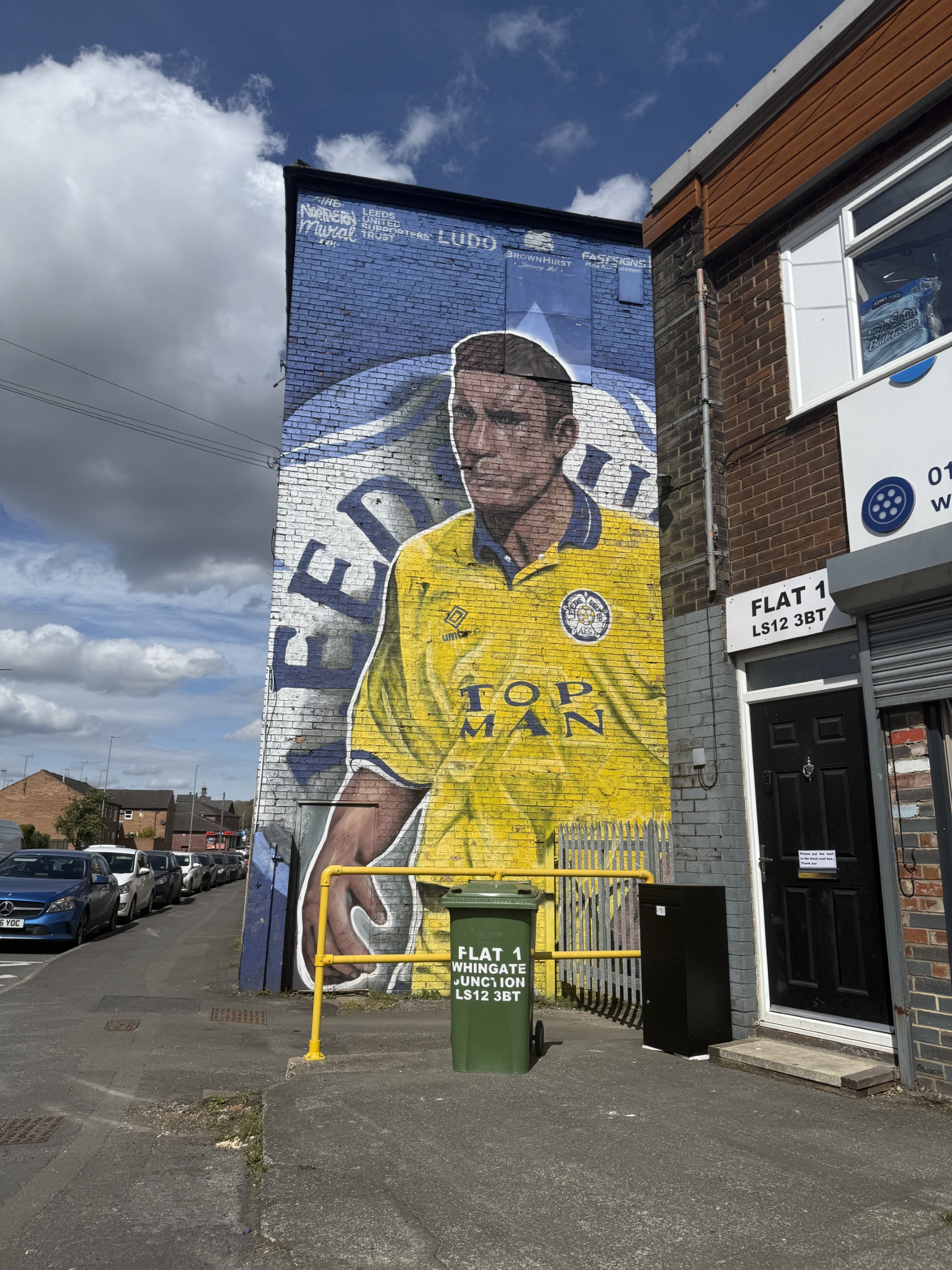
One image that i struggled to take a good photo of was the Vinnie Jones mural, this is because of the placement of the mural and the wall it was on. I couldn’t stand fully square on with the wall because there is a row of shops that interrupt the shot and blocks some of the mural, and if I wanted to get the full wall I would have had to stand in the middle of the main road but that was too dangerous to do so I had to work with what I could.
Another image I had trouble with was the Lucas Radebe mural because I couldn’t get square on with the wall as there was work been doing around the building so it was fenced off. I had to then step on a ledge and try and get the best image possible so I would have liked to of gotten a better angle on that one but unfortunately I wasn’t able to get into the right position.
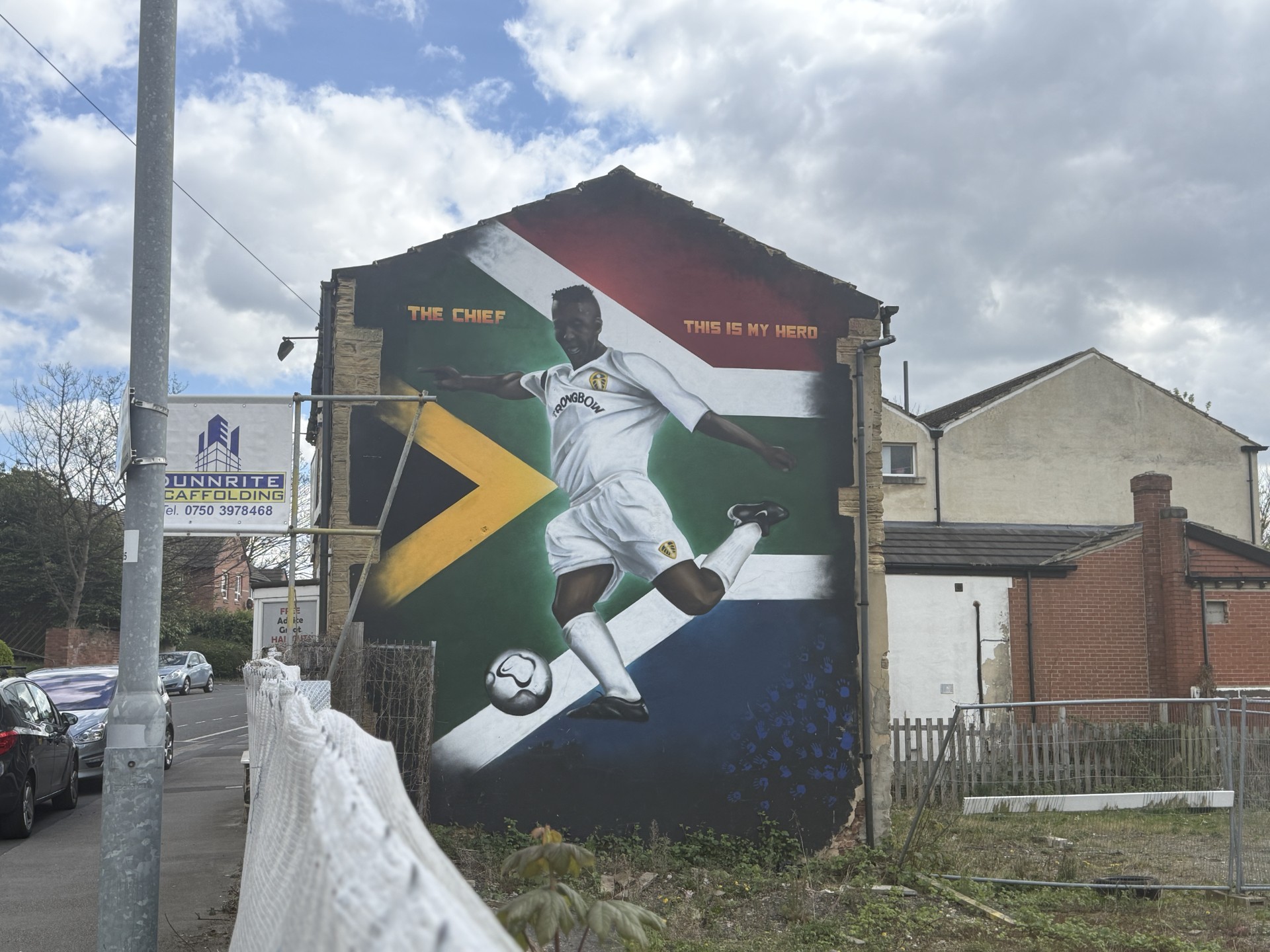
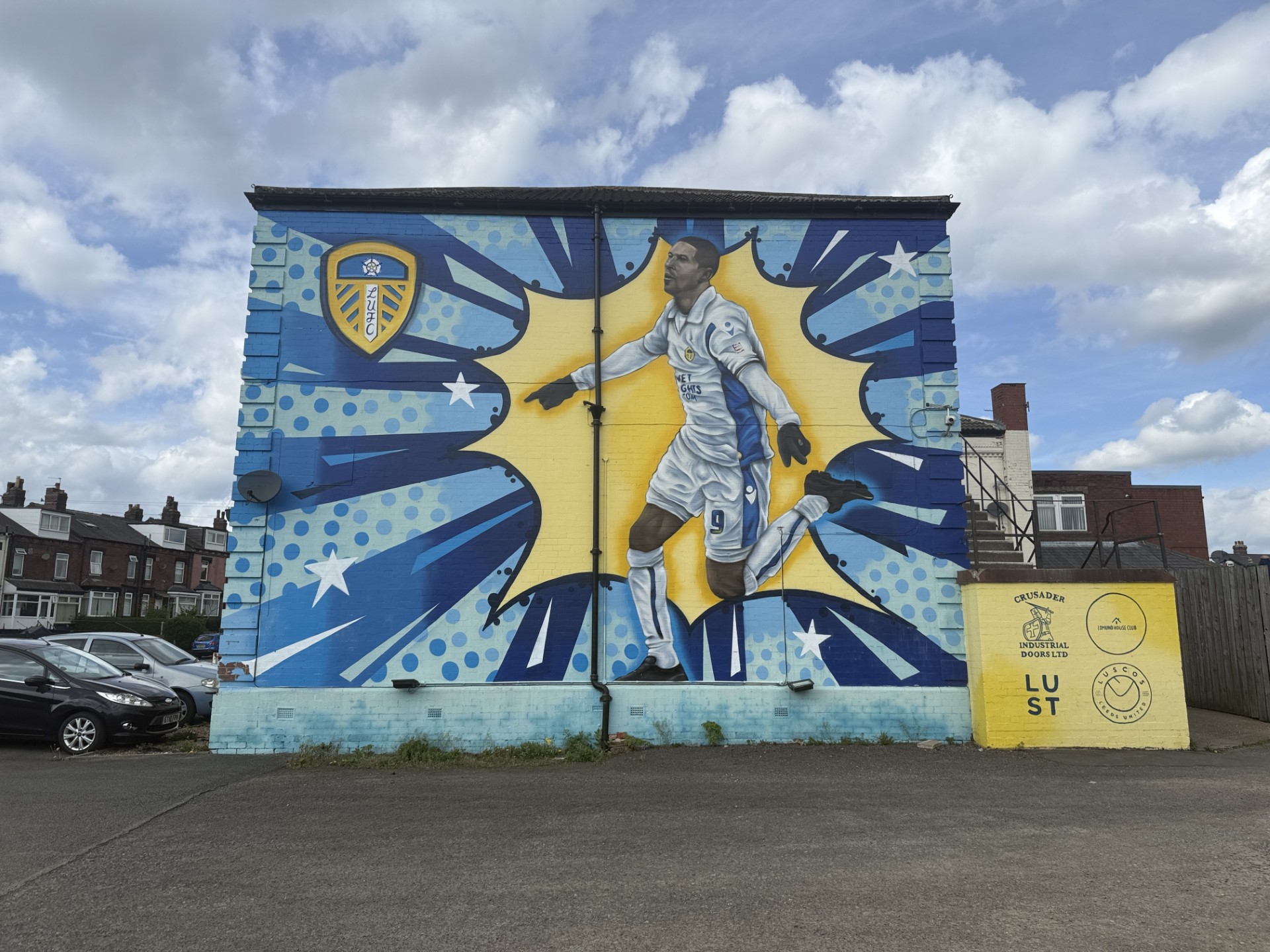
The rest of the images I feel like are taken at good angles, the way they have been taken have a bit of consistency which I think is important when you are trying to follow a pattern/theme. Especially the pad-mounted transformer boxes that have been painted as well, I thought these have to be taken similar considering they will be on the same page, but it was also important to try and capture all the detail that was on the boxes as well.
One thing i want to do when editing the images is really try and get the yellow and blues to pop to really get the highlight and focus on the painting and make them standout. This will also be good to go along with the theme colours yellow, blue and white which are the colours of Leeds United. I will aim to do this by loading the images into photoshop and changing some settings on the adjustments panel to see if I can gain my desired effects.
AFTER IMAGES EDITED
I was able to achieve what I wanted with the yellow and blues to pop out like mentioned above. I did this by going on Adjustments, Hue/Saturation, clicking the drop doen menu that says Master then going on to Blues and Yellow and increasing the Saturation slider to really get them specific colours popping without affecting the other colours around the image. Here are two examples of the before and after of the selected images.


I believe that the better one of the two edited images is the top one but I believe they are both edited to a good standard. In my opinion is makes them look better and standout well, if I could change one thing about them, I would try to learn to be able to just edit the actual wall itself and leave the background to have the sole focus on the saturation increase be on the mural alone rather than the sky as well.
Now I will put the images into my spreads on inDesign and crop them where necessary but making sure all parts of the mural remain in the image.

You must be logged in to post a comment.