Author: ltaylor2344
Work reflection 3
The work has been fun to complete I have found, this will be because I enjoy doing the design work and I have a passion for Leeds United. However, the writing side of it I found to be the thing I have struggled with the most throughout the completion of the work.
I think the content I have is good and it does work well, I just feel it could be better written but this is something I would need to spend more time on doing to improve on. This style of writing is something I have never really done before so doing it for the first time was challenging, there were situations where I was questioning certain phrases I was using or how I was wording the sentences wondering if it made sense but I also think some of that is me overthinking.
Being passionate about the topic really helped me as I knew a lot already and knew where I needed to look for the information I didn’t have, which saved me that initial struggle of getting started in the first place.
Overall I am happy with the work that I have created, I think the design is good, I made sure that everything is aligned and that there are no hyphenated words at the end of the lines to make it an easy read.
I believe the images are well taken and also edited good enough to a standard to be published, and they also suit the theme which I was looking to achieve at the start when I was putting my ideas together in the first place.
As mentioned earlier the words content could be improved but if I get the chance to do this type of writing and work again it would certainly benefit me and help me learn this type of writing style and also other writing styles as well.
I had to upload the magazine spreads on to Issuu instead of Heyzine because when I inserted the link to the final piece it didn’t work.
Work reflection 2
BEFORE TAKEN IMAGES
As I have chosen the topic of murals/artwork. It is important I try and get the best images possible to fully show how good the artwork is. One of the things I have thought about is angles and where I should take the photographs from. After speaking to Karl and looking at other images taken of murals it seems that a good idea to do is take them square on and centre them if possible depending on what the piece of work is.
Also I have to go on a day where it isn’t too dull so I can have some light to work with when taking images as well. This will help when it comes to taking the images with different settings as I will have more room to play around with.
I plan on taking images with different f-stop settings as well, mainly using lower settings to try and get that shallow depth of field look that really shows the focus on the chosen piece of artwork.
AFTER IMAGES TAKEN
My images have been taken and now edited as well, it took me around 2-3 hours to go round Leeds and get the images taken, as well as nearly 30 miles of driving alongside that.
The weather was okay so I thankfully had blue skies to work with which I would say will make the images better than if it was just dark clouds.
One image that i struggled to take a good photo of was the Vinnie Jones mural, this is because of the placement of the mural and the wall it was on. I couldn’t stand fully square on with the wall because there is a row of shops that interrupt the shot and blocks some of the mural, and if I wanted to get the full wall I would have had to stand in the middle of the main road but that was too dangerous to do so I had to work with what I could.
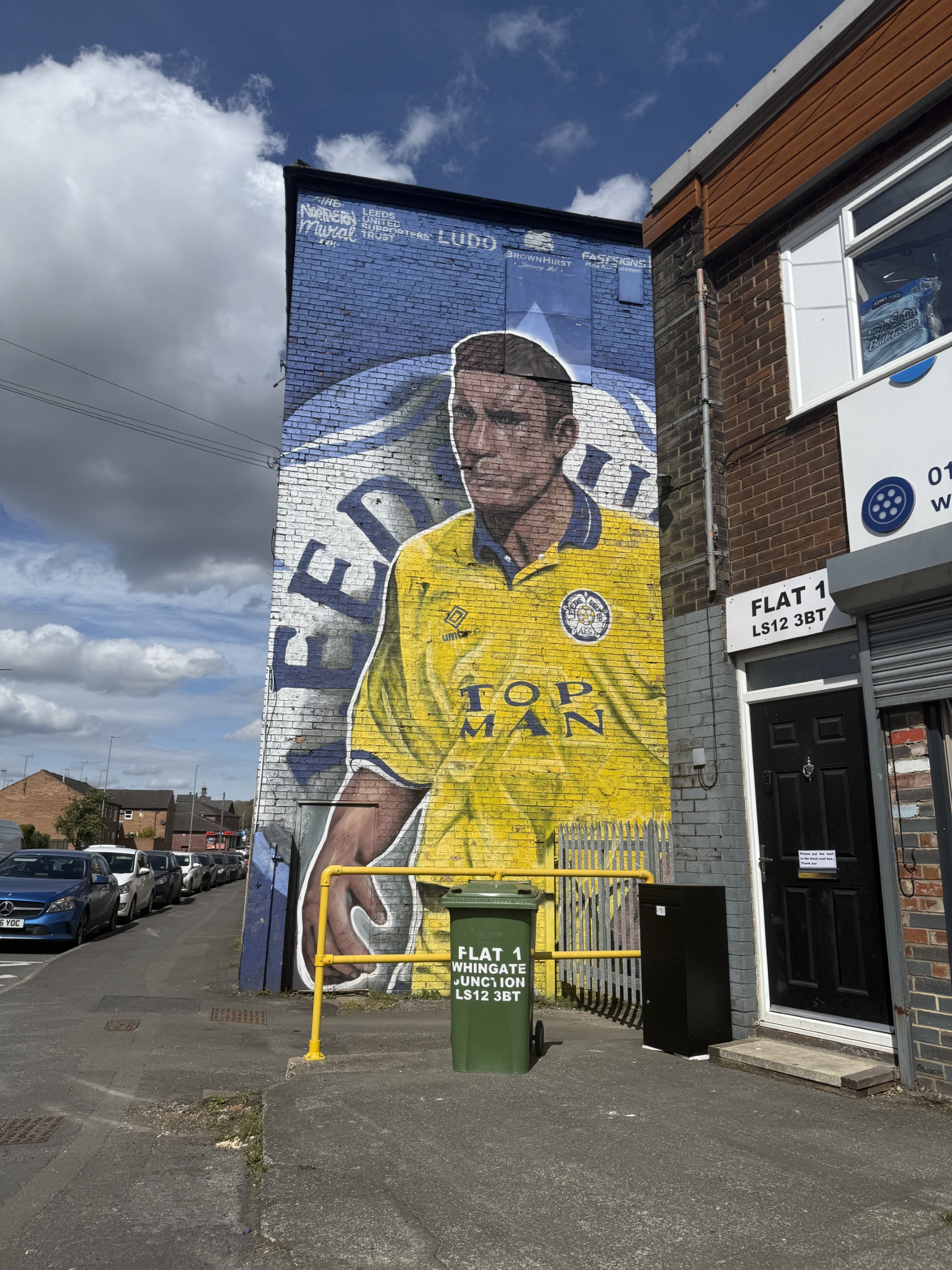
Another image I had trouble with was the Lucas Radebe mural because I couldn’t get square on with the wall as there was work been doing around the building so it was fenced off. I had to then step on a ledge and try and get the best image possible so I would have liked to of gotten a better angle on that one but unfortunately I wasn’t able to get into the right position.
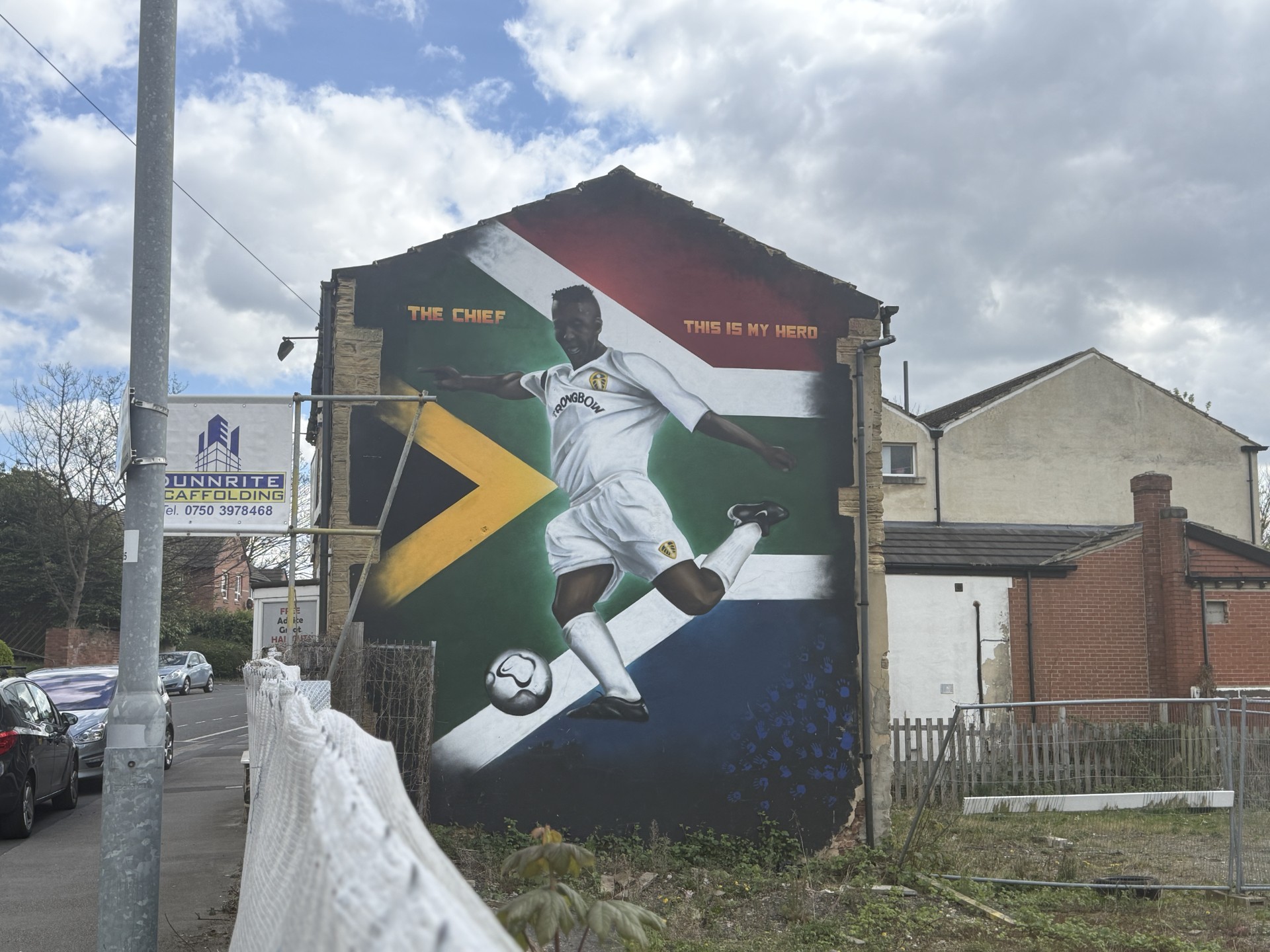
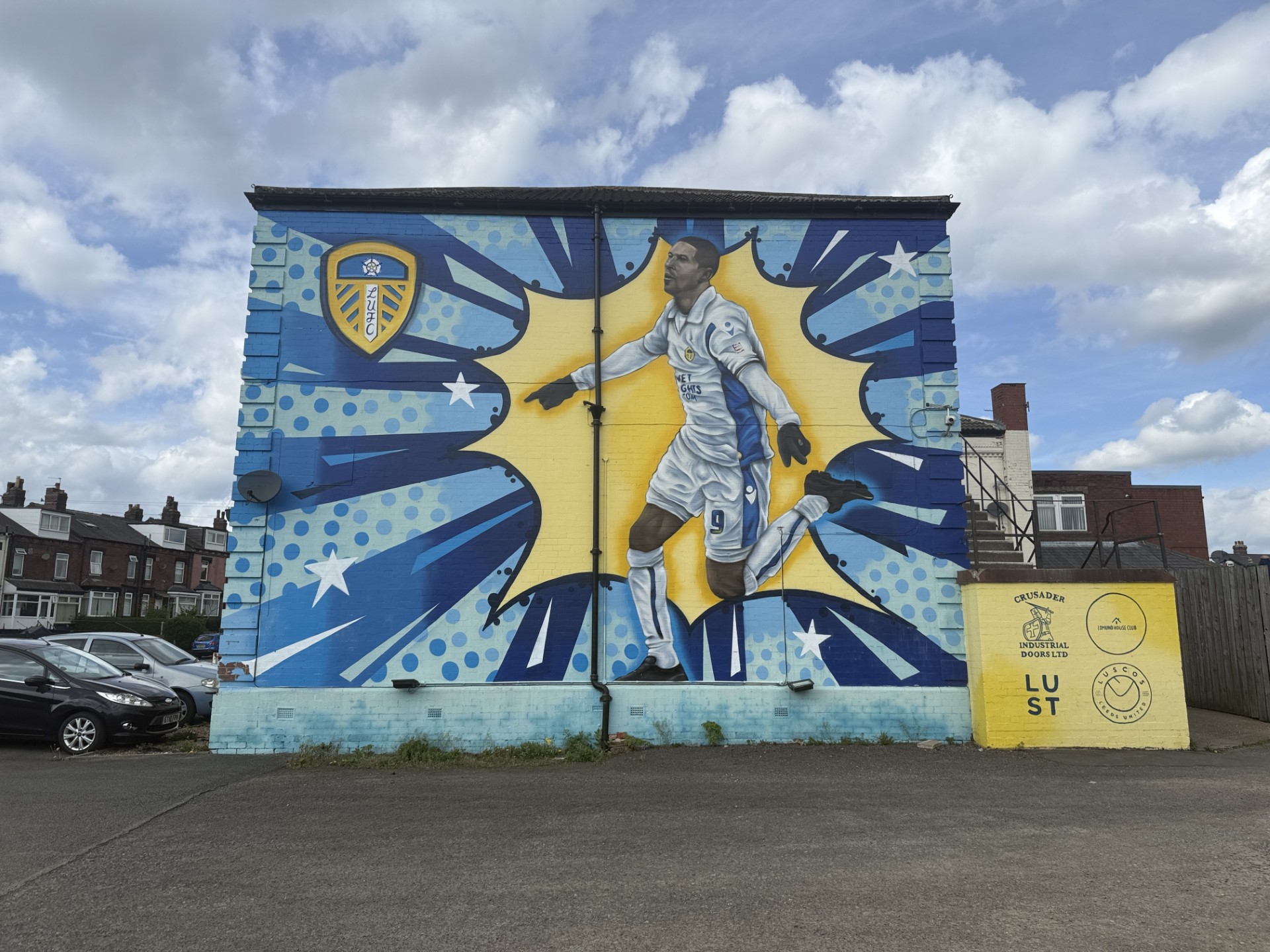
The rest of the images I feel like are taken at good angles, the way they have been taken have a bit of consistency which I think is important when you are trying to follow a pattern/theme. Especially the pad-mounted transformer boxes that have been painted as well, I thought these have to be taken similar considering they will be on the same page, but it was also important to try and capture all the detail that was on the boxes as well.
One thing i want to do when editing the images is really try and get the yellow and blues to pop to really get the highlight and focus on the painting and make them standout. This will also be good to go along with the theme colours yellow, blue and white which are the colours of Leeds United. I will aim to do this by loading the images into photoshop and changing some settings on the adjustments panel to see if I can gain my desired effects.
AFTER IMAGES EDITED
I was able to achieve what I wanted with the yellow and blues to pop out like mentioned above. I did this by going on Adjustments, Hue/Saturation, clicking the drop doen menu that says Master then going on to Blues and Yellow and increasing the Saturation slider to really get them specific colours popping without affecting the other colours around the image. Here are two examples of the before and after of the selected images.


I believe that the better one of the two edited images is the top one but I believe they are both edited to a good standard. In my opinion is makes them look better and standout well, if I could change one thing about them, I would try to learn to be able to just edit the actual wall itself and leave the background to have the sole focus on the saturation increase be on the mural alone rather than the sky as well.
Now I will put the images into my spreads on inDesign and crop them where necessary but making sure all parts of the mural remain in the image.
Work Reflection 1
Now I have my ideas set for what I want do do. I have done a mock up for what I roughly want my pages to look like so I can start with ideas ready when I load up InDesign.


I have all the places I need to go to noted down so I will be ready to take the photos so I know exactly what I will have when they have all been taken.
I want to start the intro page off with a map that has pins on it which will be where the murals/artwork are located. This will also allow me to be able to get my colour scheme firmly in place from the get go which will be yellow, blue and white which are the main three colours of Leeds United.
My route that I will be taking to acquire the photos will be just under 30 miles and approximately 2-3 hours going round and taking the photos to get the multiple angles that I need with the different settings for the images
Week 6 – Workshop
Before

After


I chose these photos are they are both outdoors, the one with Fin and Arthur has two people to focus on and the one with just arthur has some colour in the background.
I attempted to make the colours more warm and also bring out the colour in the second photo and I believe I did that make adjusting the brightness and contrast and also changing the exposure levels alongside playing with the hue/saturation settings.
Week 5 Workshop
Fast Shutter Speed
For the fast shutter speed photo I took it on my iPhone. I got Fin and Ted to jump whilst I was using the burst setting on my phone by holding the button and dragging it to the left, I held it for a while to get a good amount of photos to choose from. It was an easy process and the photos I captured came out solid and crisp.
Slow Shutter Speed

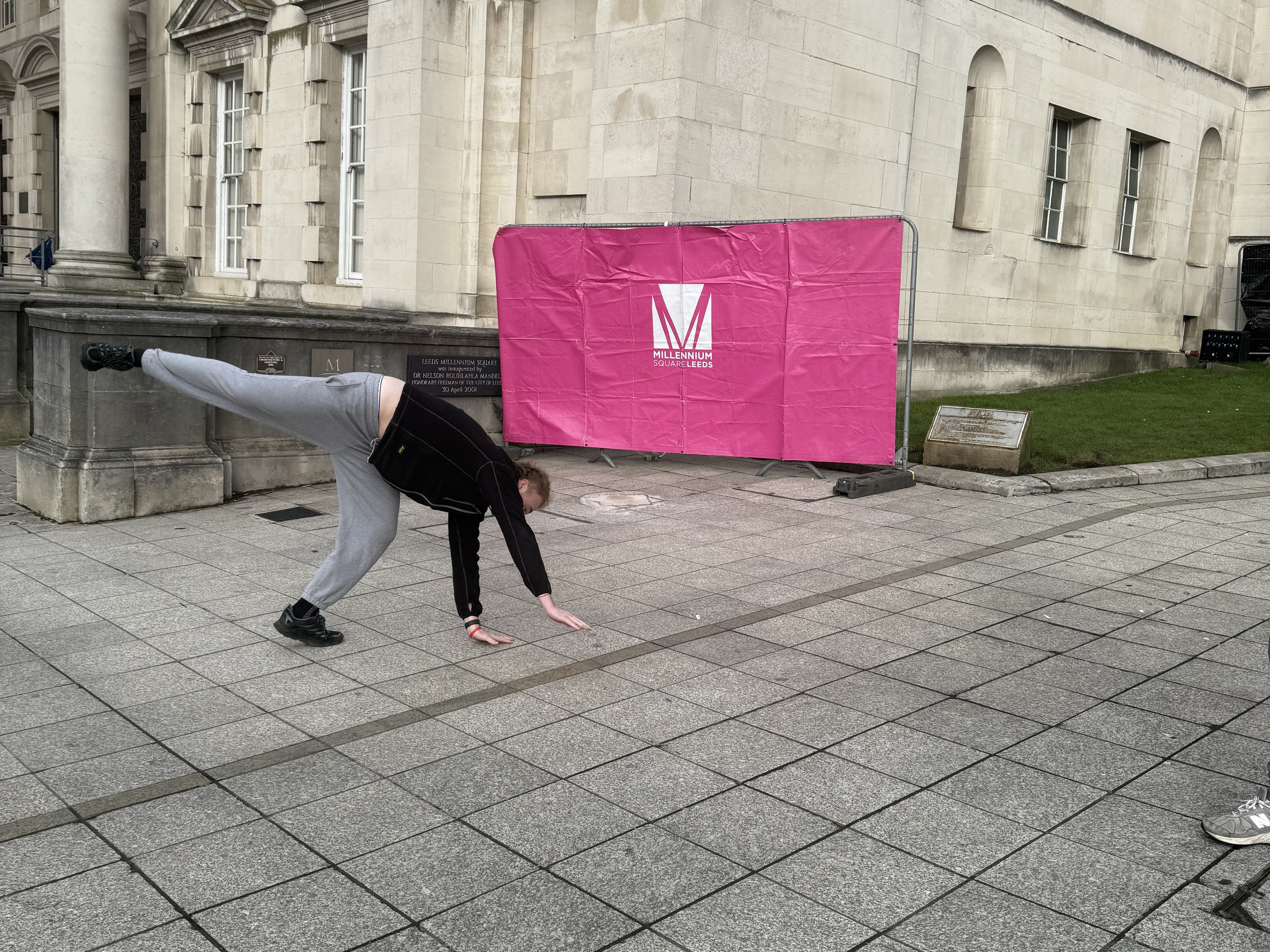
This photo I took was of Arthur doing cartwheel. I put the setting on live photo and took the photo. Once I had the photo I clicked on where it says ‘Live photo’ and put the setting to ‘long exposure’ which turned out like this. The only issue is that you can barely see Arthur but it is because of the speed he was going but also because it isn’t a real setting for shutter speed so it isn’t the best to try and get the result you want by using a phone camera.
Research
Shutter speed is measured in seconds/fractions of a second. Slow shutter speed means that more light can be captured in the photo, this also will make the photo have motion blur in it which is good if you are looking to capture illustrative images and if you want the best result it is essential to have a tripod to have the surroundings stay as still as possible.
Fast shutter speed means the shutter is open for a shorter period of time capturing less light. This setting when taking an image means you will capture movement and it will freeze it instead of capturing motion blur, these types of images are good for journalistic purposes as they can tell the full story. Often used in areas for sports and wildlife.
The ISO setting affects the sensitivity of the camera to the light. Higher the ISO the more sensitive to light which captures a brighter photo. If you are situated in low light you can raise the ISO and it will have a clearer picture, however if you don’t have the quality or go too far you can end up making the phot grainy instead. If you’re in Ideal/bright light settings it could be beneficial to lower the ISO setting to remove any ‘noise’ coming from excess light to have a better quality image.
Week 4 Workshop
F-stop 1.4

F-stop 4.5

F-stop 16

I positioned James in this position in all three photos as I felt with the background having the buildings on each side then a clear view of the sky at the back with the view of the sun trying to break through the clouds it would be good to experiment with.
The first image I took on the lowest f-stop setting which on my camera (iPhone 16 Pro) is 1.4, this allowed the shot to fully focus on James and completely shut out the background allowing a nice crisp focus on James. The background been blurred gives an effect where it makes James standout, which he does anyway because he is the centerpiece of the image. But with this setting if you were to be in a crowd of people, lets say a festival perhaps, and you had this on you would be able to make your person the main focus which would be ideal so you don’t have a loud photo.
The second photo was taken with an f-stop setting of 4.5, this is what my camera said to me that the middle (default) setting was but I believe it changes when you adjust the zoom on the image, I think as well my portrait on my camera was set to 2x but this could be the standard for all portraits but I’m not so sure. This probably turned out to be the best image out of the lot of them which makes sense considering it told me this was the recommended setting. I think the background on this one works perfectly with the focus on James because it blurs it out but you can still make out what’s what without having too look too much whereas compared to the first image I think you look at it and it doesn’t look right with the intense blur.
The third photo was taken with the highest f-stop setting which was 16. I like the way it captures the whole of the background and now knowing the details of the settings and what they do I would feel more confident if someone asked me to take some photos of them to get better results than just using the default settings on everything. This image I think doesn’t work well but it was a good tester for me to see the differences. If I was to use this setting again I would have it where it is a scenic background where the sun is rising/setting and the person in shot is facing away from the camera and towards the background with the focus on the scenery to fully exaggerate how good the view is.
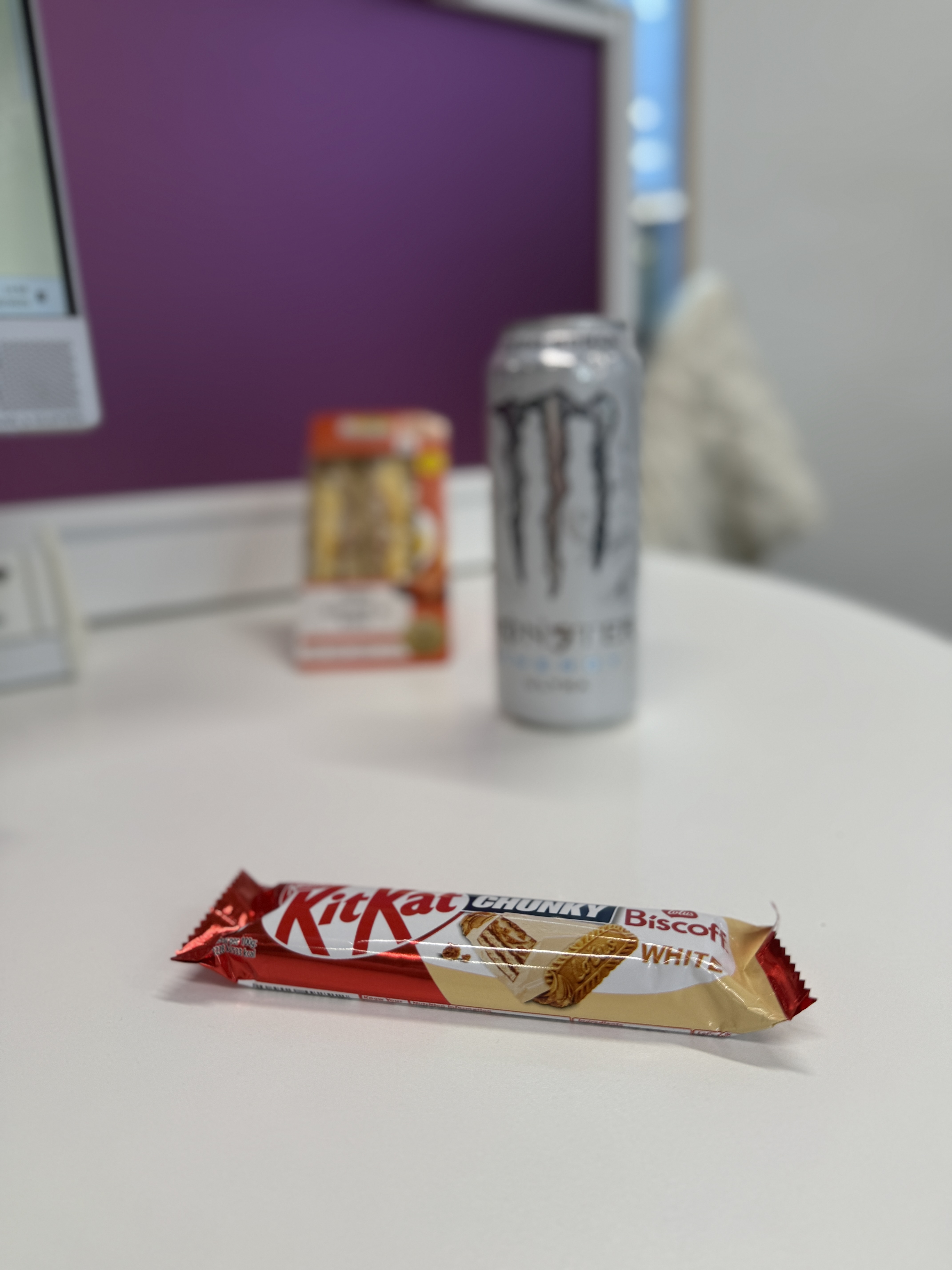
Close object in focus
All three objects in focus

This was a confusing task for me to try and complete and I don’t think it worked out in the end but I did give it a go. The first image was quite simple, however the wrapper on the KitKat made it hard to get a full focus on it but nevertheless it still worked, all I had to do for this was use a lower f-stop setting and put the focus on the KitKat and it put the other items out of focus making it look like the KitKat was the main item in the meal deal.
The second image I did a lot of playing about with after doing some googling and this was the best result I achieved, out of 20+ images as well which became frustrating. To get it to this stage of focus all round I increased the f-stop setting from the last one and I increased the exposure levels and this got all three of the items in some form of focus. I’m not sure if it was the size difference of the objects that made it hard or it was just me not using the right settings but it was a challenge to get it to this point. I am definitely going to have a play around with this and see if I can achieve three objects and different lengths all in focus at the same time.
Week 3 Reflection
This week was an interesting workshop in my opinion. I had to complete the task which was to find three images, one which has been ‘constructed/set-up’. one taken from a POV that affects the story and one where the ‘meaning’ can be disputed.
The first image I struggled to find one when searching but I believe I wasn’t looking for it in the right way but was also overthinking. Then the image I chose came to my head and it stuck with me so I used it. The main reason I chose to use that image was because it was an image that I saw many different versions for especially since covid and it was something that had impact on me and also other people around me as well. You could say it has many meanings but the main one has to be respecting everyone as an individual and I still believe this message needs to be continued to be pushed, and by doing so with these constructed photos to get messages across to people.
The second image I chose because I wanted to include a sports image in there and I think the placing of the photographer alongside the fish-eyed angle does affect the story of the photograph. I think this photo does tell a story in itself and regardless if you know the people or not within the photo, you know that all the players have a huge amount of respect for the coach and the angle it is taken with gets as many people in as possible to show the amount of people there is who will listen to him no matter what. I also chose the American football image as the Superbowl has just happened and it is all over social media at the minute.
The final image I chose because it sort of links back to the first one but also I accidently got caught in the riots when I was out and saw it first hand and it was odd. The dual meaning I think definitely favours the side where people believe it is unacceptable but there are people who agree with what happened and are happy that it did. It shows the place where society is at the minute despite the progress that has been made over the years. There will always be people with that far-right mindset its just when these riots happened a lot of the people who were ‘quiet’ about it ended up showing their true beliefs to everyone.
Week 2 Reflection
Unfortunately this week I was unable to attend the session due to my car playing up again, I did manage to get it working later on in the day so I came to the library and started to go through the set tasks.
I found the research particularly interesting and it was something I never really thought about, the history of genres of photo journalism. I never even thought before the session that there were many types of ways to go about it.
Obviously studying sports journalism, i chose to look at the history of sports photos. One of the main aspects of photos in sport is capturing motion and you can certainly tell the difference between the quality of when they first started in the 1800s to the present day.
I think the reasoning behind the horse photos makes it for me, a debate whether a horse keeps its foot on the floor when galloping and then after they decide to try and prove their points, get a team together and settle the debate.
Also I chose to include my favourite photo in the Usain Bolt one as I believe it is all a matter of opinion and that photo shows the pure brilliance of him and how much of an athlete he was compared to the others.
Week 1 Reflection
In the first week I was unable to attend the session due to my car not working properly. This wasn’t ideal but it was only a minor inconvenience as I was still able to complete the task that was set.
My story I chose to do was about how studying in a space dedicated for study (library) will help you improve your grades. I knew one of the lads who was in the library at the same time as me so I asked him if he wouldn’t mind me asking a couple of questions about his ways of studying.
He gave me the answers that I needed for the story and it aligned with what I wanted to write about as well quite nicely. The photo could’ve been better, potentially one of him studying, but in my head at the time I wanted to try and showcase part of the facilities (books) available at the library for people to use.
It did give me an insight on how it is to approach people in a space where people might not want to be approached. Thankfully I knew Ayden so it wasn’t too awkward but it was still a weird one where you don’t want to disturb someone when they are in full-flow state.

You must be logged in to post a comment.