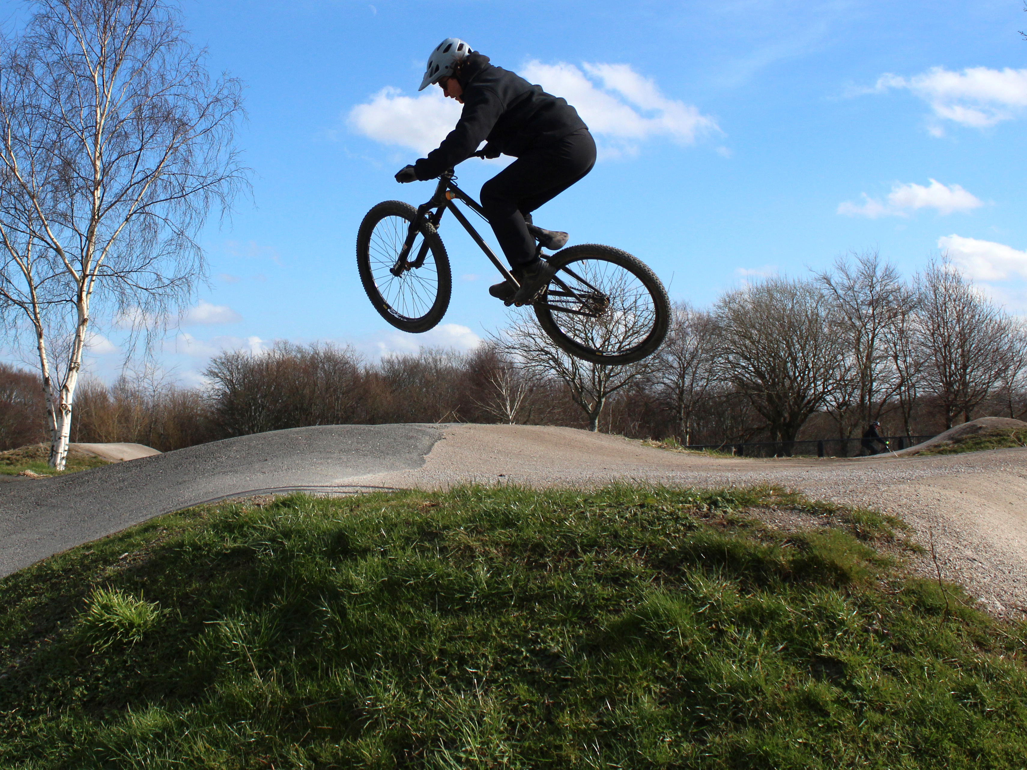
For my photojournalism project I decided to look into homelessness in Leeds. I went with this because when I moved to Leeds 3 years ago I noticed a lot of homelessness.
At first I wanted to do my project based around the Instagram account ‘Humans of New York’ but in Leeds. So originally I wanted to interview people who have done something great for their community or for Leeds but after speaking with Karl and Ruth, we concluded that it was too weak and not niche enough. In the end we came to homelessness.
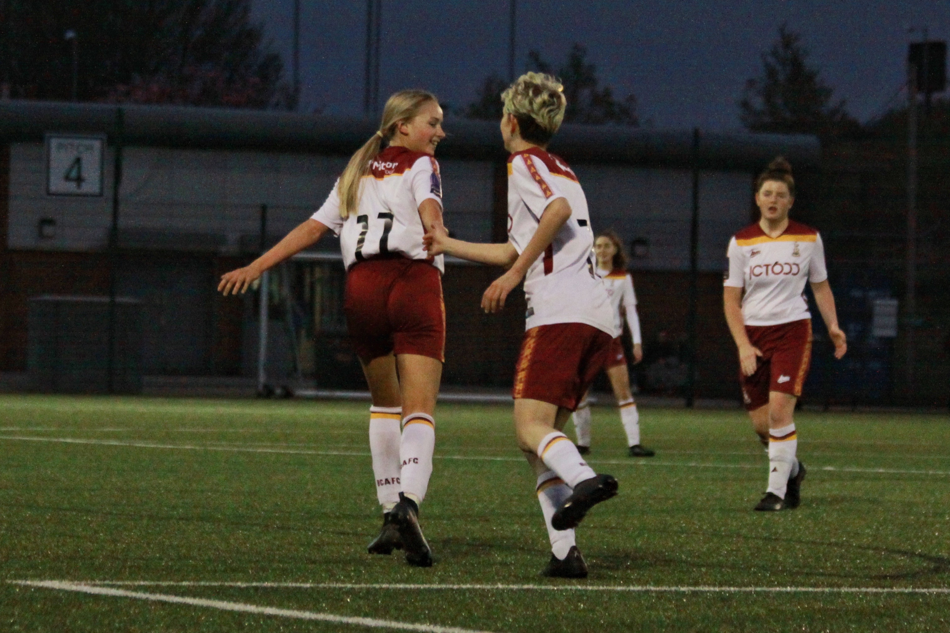
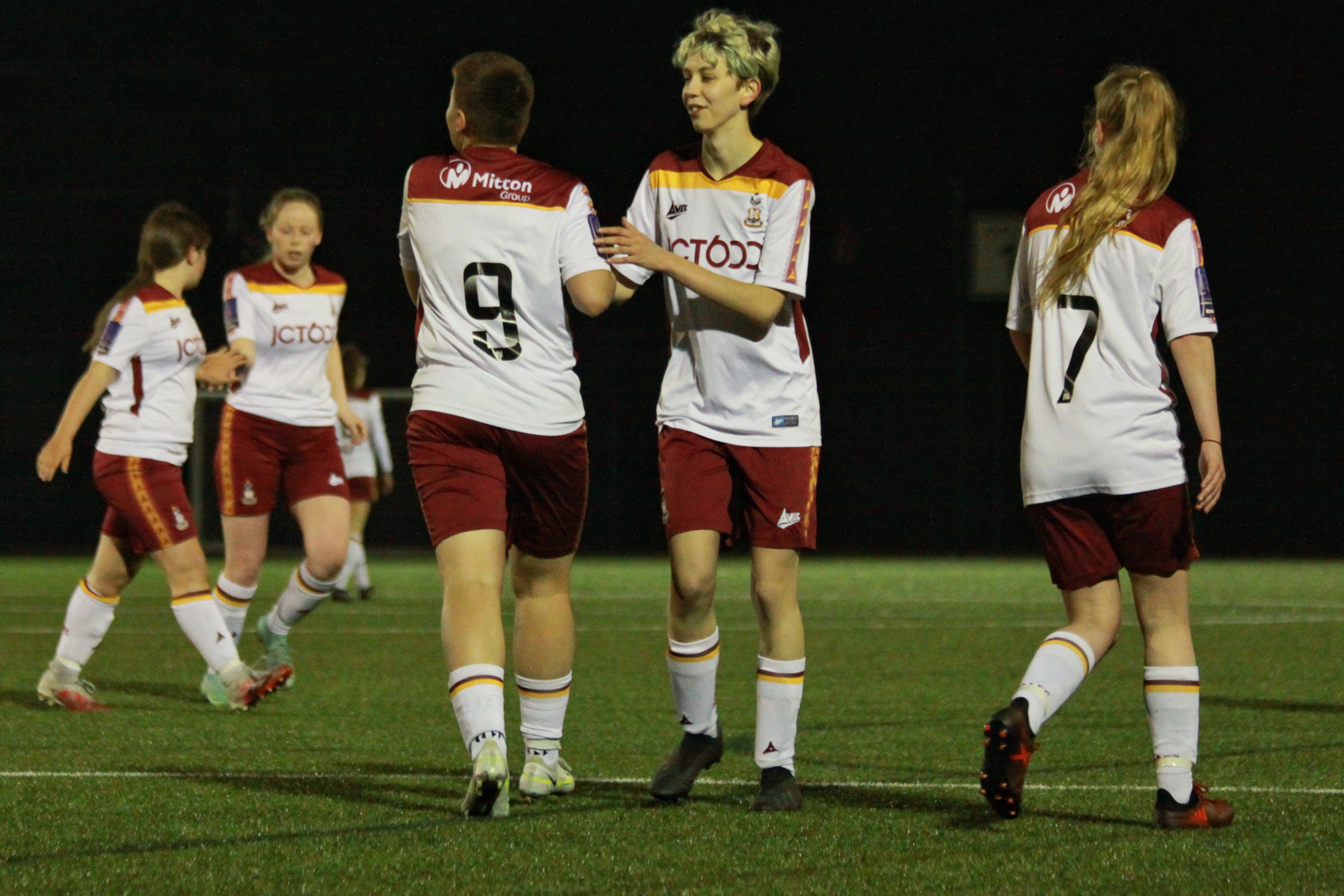
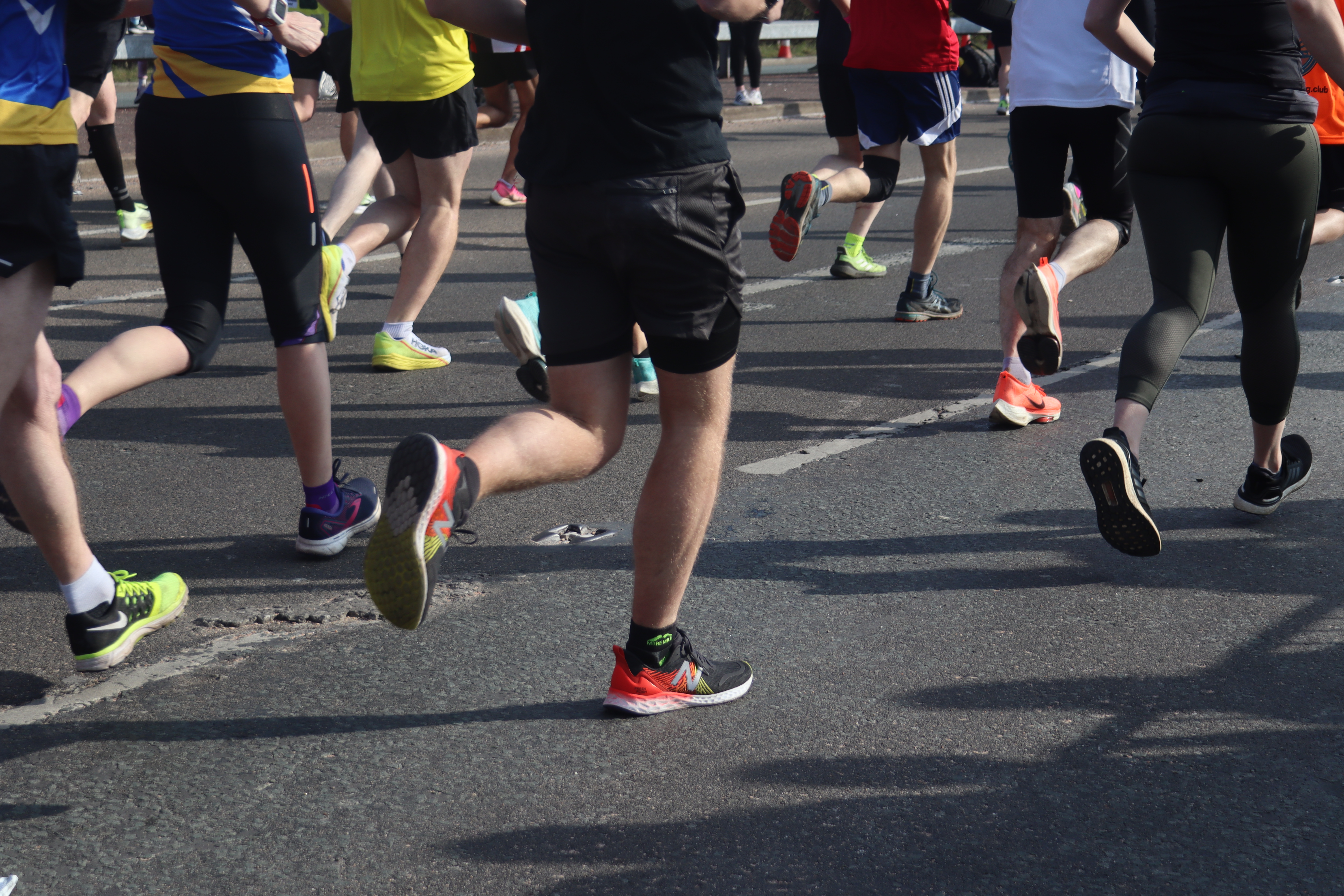
This week I spent a lot of time reediting some photos to make sure they were perfect and I also did some writing. I managed to get to one more game to do some more photos and got some great team pictures. The team lost 7-1 to league champions Huddersfield, but not letting them have a clean sheet was a victory in itself.
Here are some before and after photos of two photos I am using for the project:
Before and after editing and cropping
As it was a very sunny day, so a lot of the images were washed out. I used photoshop to enhance the colour and create a tighter crop on Ash. I also brought out the colours on Ash’s top to make it really stand out.
Before and after the minutes silence
The Huddersfield match was held later on in the day and with no lighting on the pitch, it was quite dark. I used a low shutter speed and a high-ish aperture to create the background blur. I then upped the brightness and changed some levels of the photo to make the colours stand out a lot more.
For the writing, I have done some research on mental health in football and given some examples of female footballers who have either given up on football or taken breaks from the sport for mental health reasons. I have spoke about Val’s mental health problems and how she got back into football as well as a small introduction to the club.
I also decided that I would only focus of Ash and Val’s story. I have more than enough material with both of them. Furthermore, looking through the pictures, I felt as if I didn’t have enough of Gemma due to her lack of game time.
I am halfway through writing the article and have selected the photos I will be using. I finally interviewed Ash. Due to her ADHD she kept forgetting about the interviews but eventually we managed to have a chat on the phone about her experiences. She gave me some really useful information and quotes which really show her personality and character
I was provided with feedback before I submitted my project, which I acted on accordingly.
Overall feedback related to light sensitivity and picture quality.
One photograph was taken with the subject faced to the camera.
The chosen picture
I thought that the picture added to the narrative of the story, with the boys entering the tracks, and the relevance being told through the text in the article. I also liked the positioning and even though you could not tell the expression of her face, I felt that the slump in her body language expressed a lot. I also thought that the greyness and shadows in the picture worked well.
Nevertheless, when I thought about the feedback, I recognised that I did not have to use the picture, or could use a better picture somewhere else down the line. I did agree that the back of her clothing was just black, and therefore didn’t contribute to the story. As, of course, photographic journalism will have different requirements than that of, say, artistic photography which is completely different.
Next, I edited a few pictures which I was told could be redeemed were they not so dark.
I lightened the image and added accentuated highlights
I felt the image had much detail reclaimed and allowed for a clearer and more informative view for the reader.
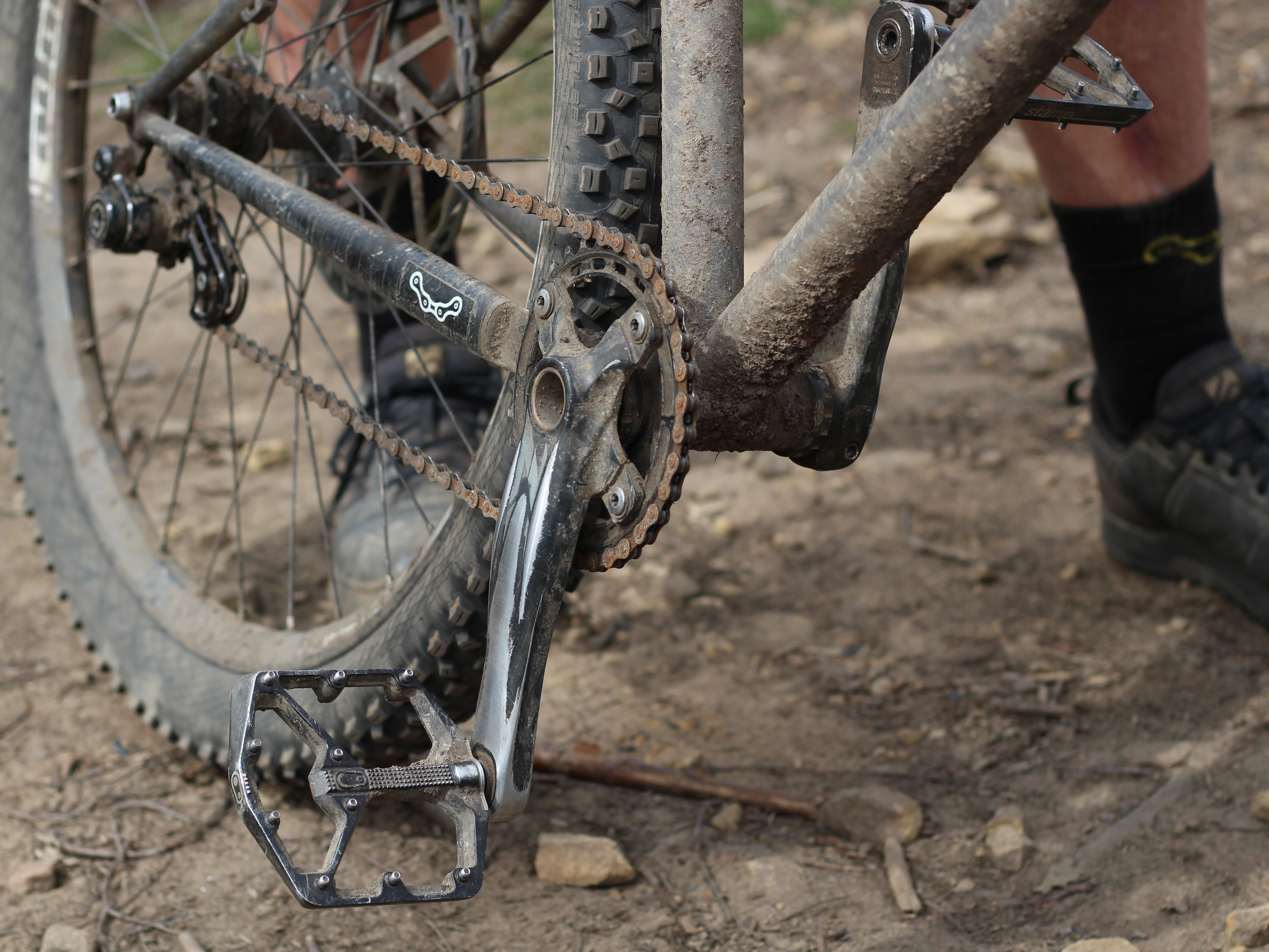
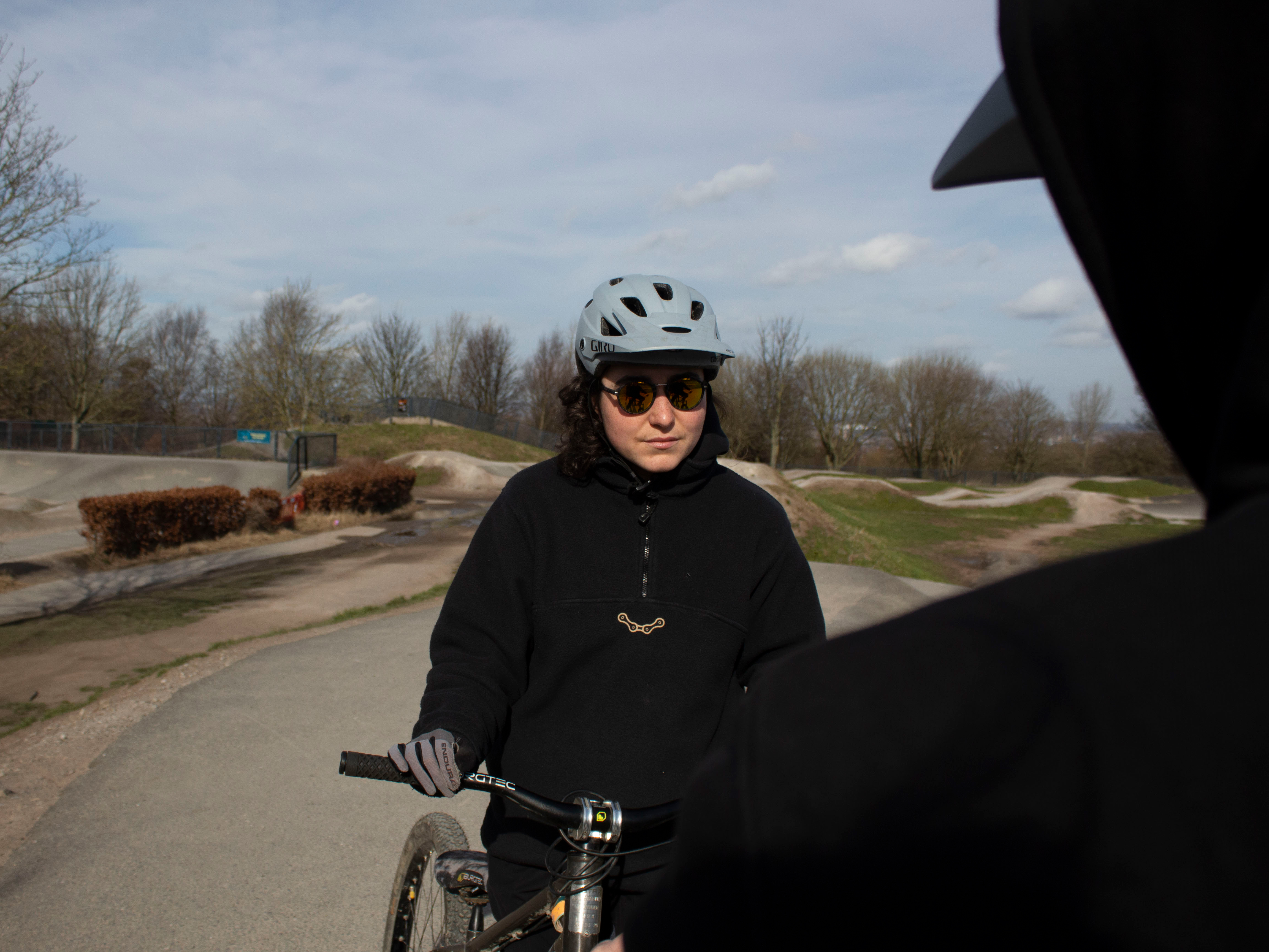
I was also told to remove around three pictures as the good-quality pictures included otherwise were enough to narrate the story. I did in fact remove these pictures, and decided to upload another instead, which was perhaps a slightly risky move as I would have no feedback before submission:
David Matjas stands next to his MTB bike
I focused on the praise my photographs received. I made sure that the picture I included then, went off the back of that feedback.
For example, I was told that I am good at composition. Pictures which added detail to the story were also impressive.
I used abstraction and realism to be creative with this photograph. I felt it worked well because of the composition, David’s involvement, the TBC logo on the bike frame, and the muck of the ground. It also balanced well with the other pictures I had taken, and ensured that I was not being repetitive in my photo narrative.
Overall, I am very happy with the outcome of the article. I always felt that I was severely bad at taking pictures. Through the project, I have begun to understand my capabilities in photography, and how pictures can truly contribute to journalism. Photography is a lot more complex than what I previously thought when it comes to journalism. I had to continuously remind myself not to experiment too much; to be too abstract, and to not be too artistic in my expression.
I realise I am much more capable of producing those factors which make a good picture.
My strengths and weaknesses in photography can now be honed in on, and is very relative to the climate of today which is technology-focused.
Due to focussing on the final project, I have not had much time to update my progress. However, through planning carefully and balancing out my workload – it has made it easier for me to manage my time efficiently.
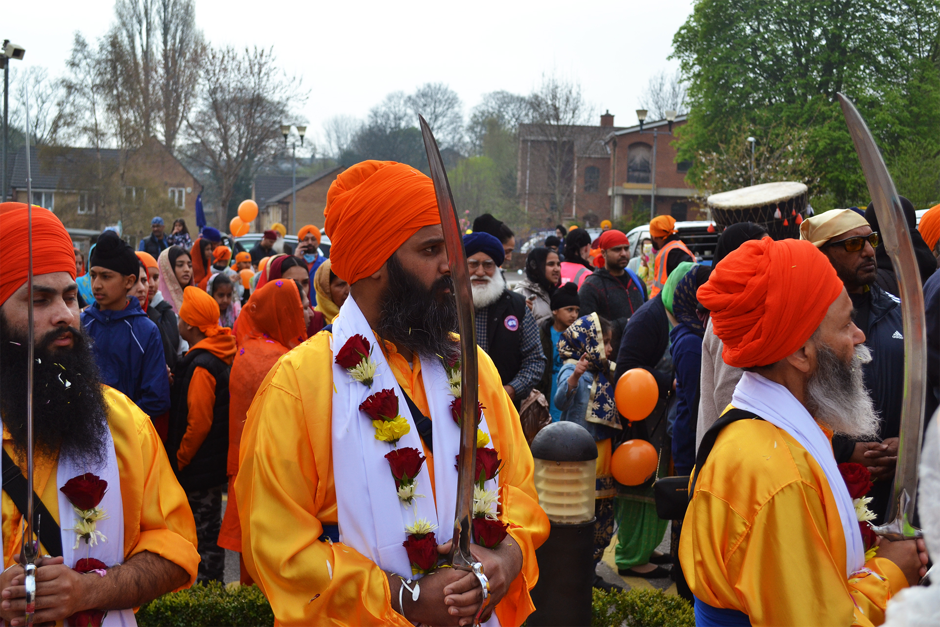
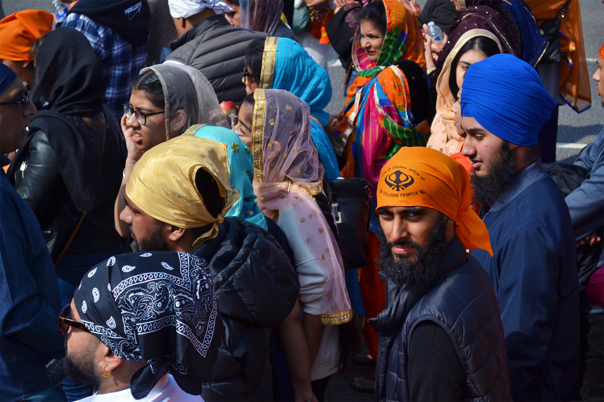
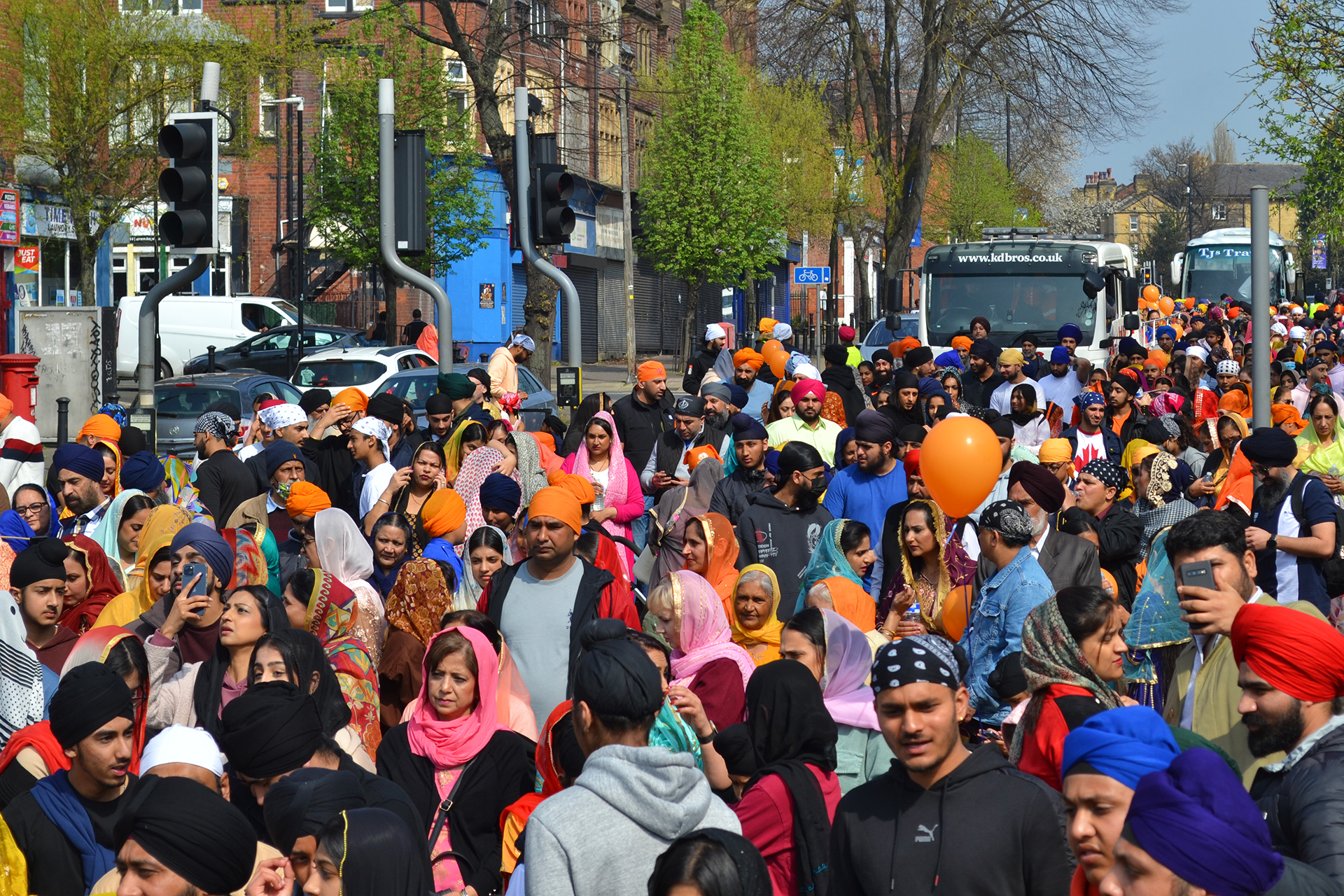
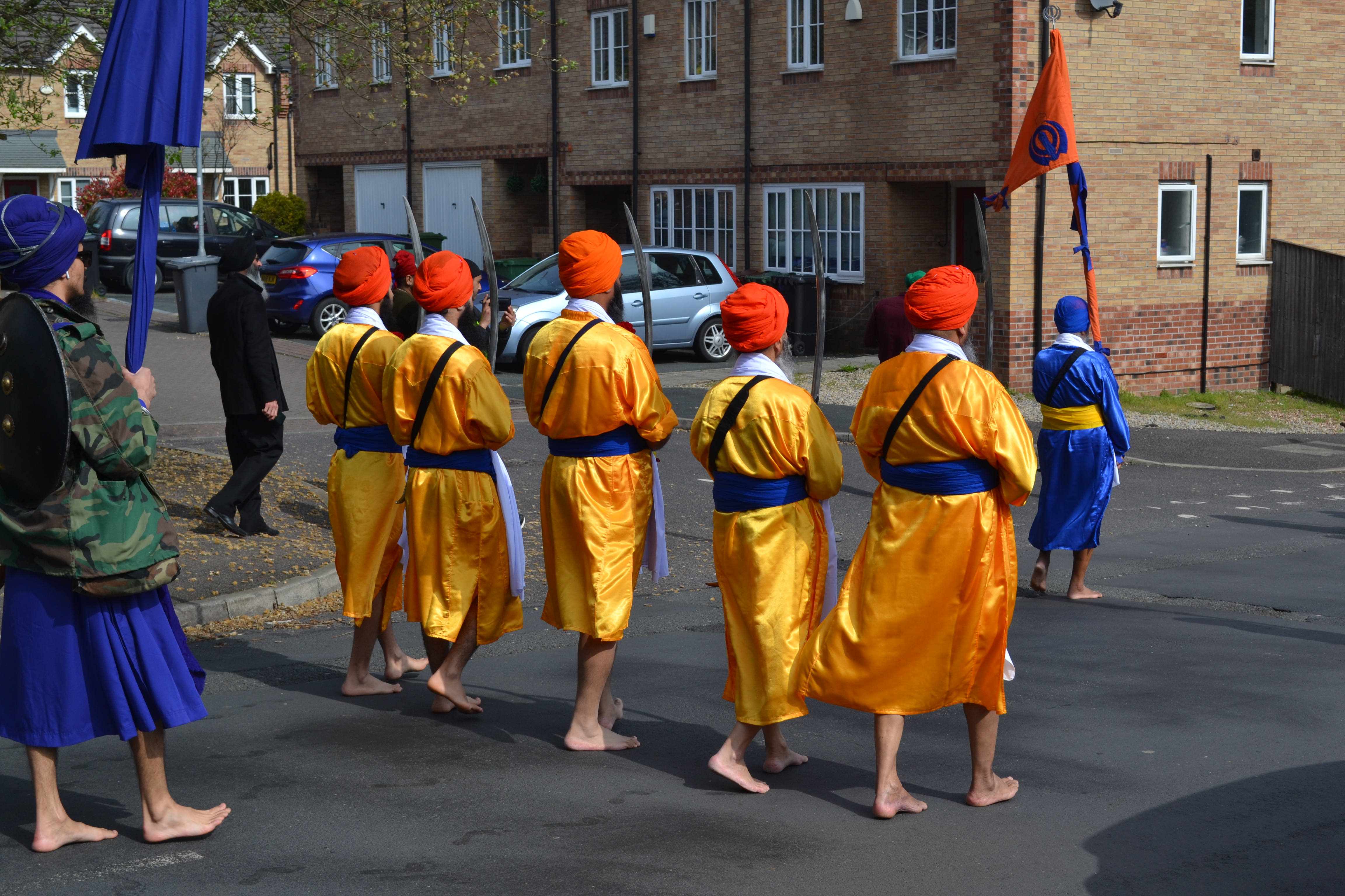
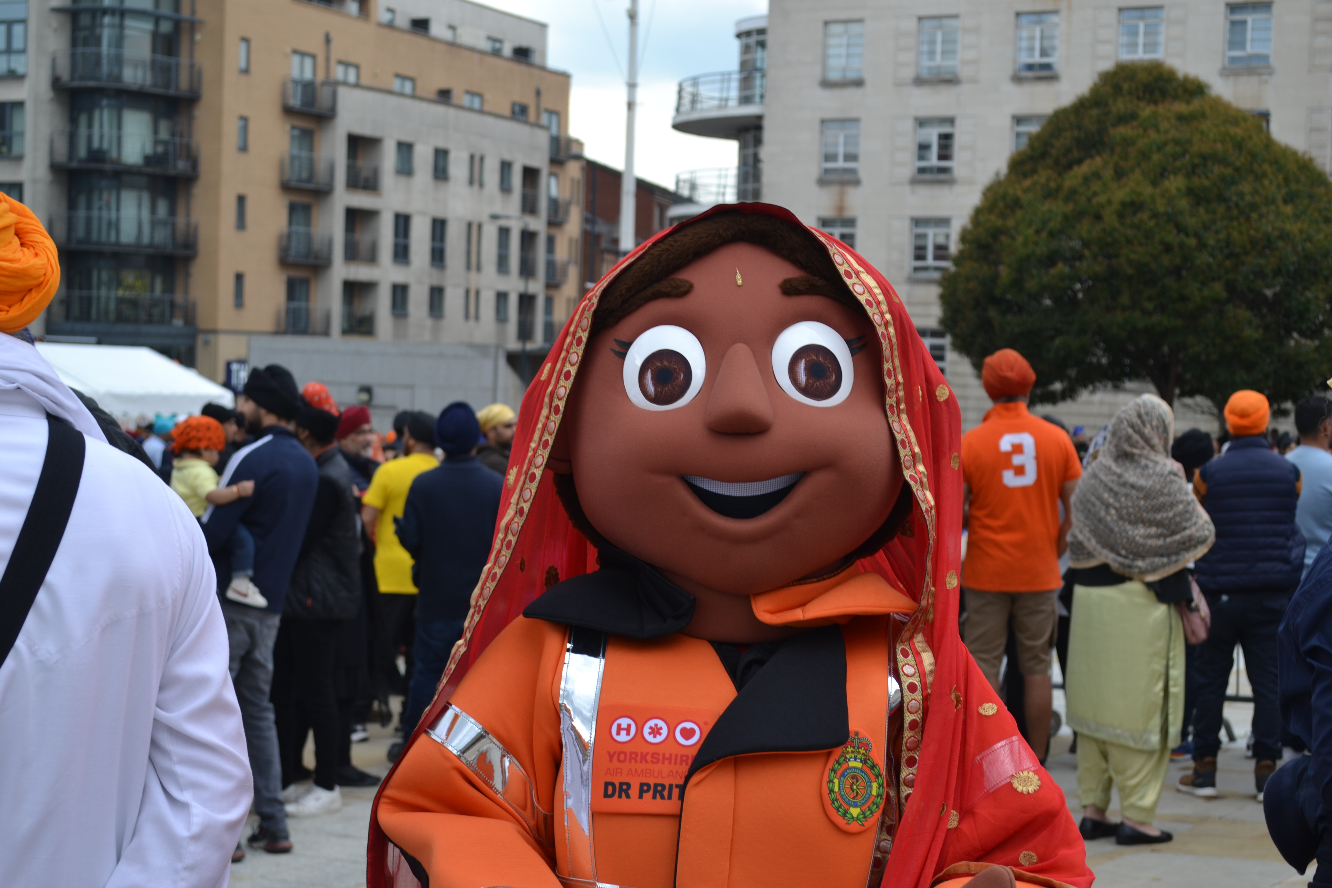
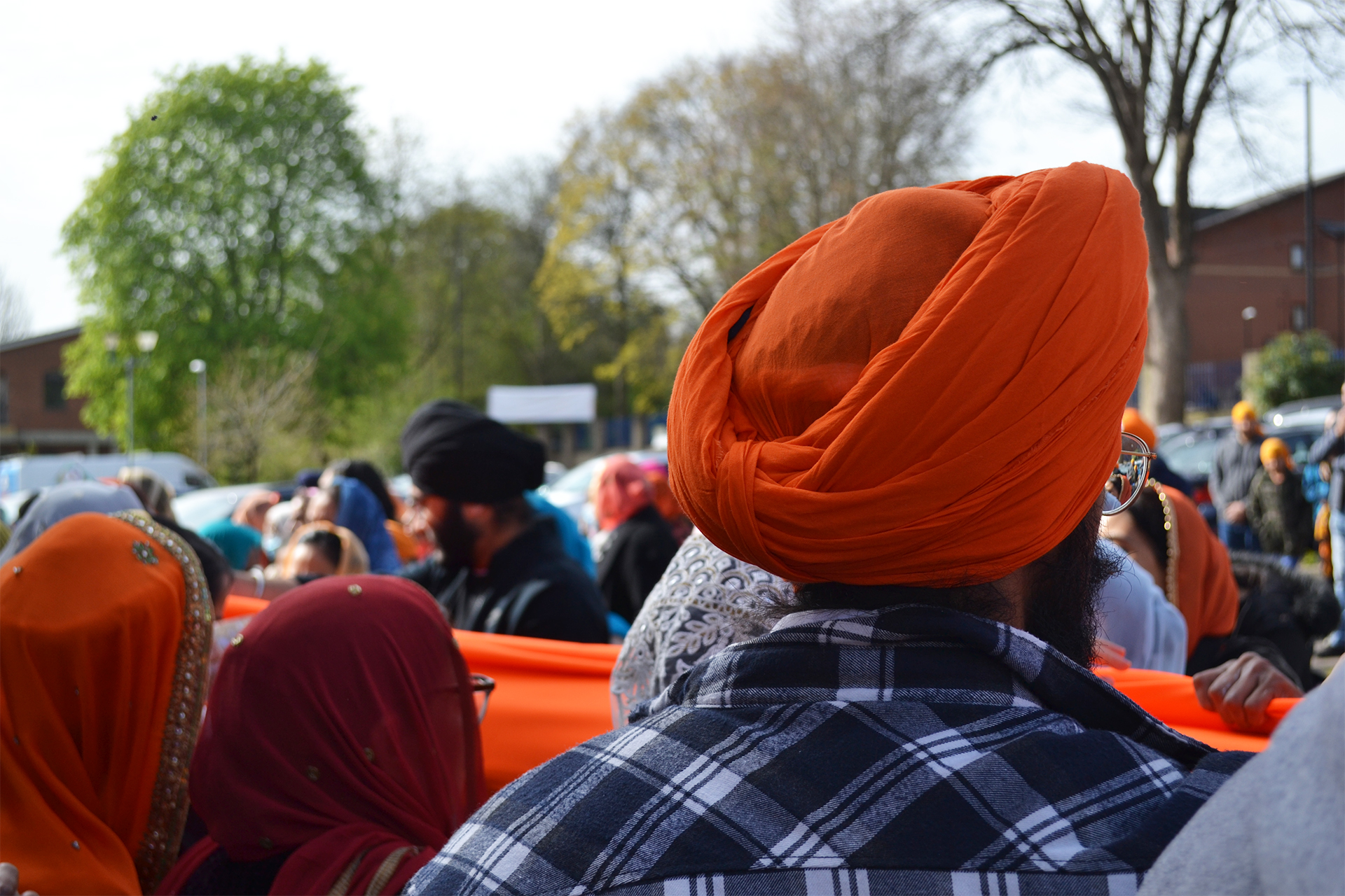
The Vaisakhi event went very well, I managed to get lots of photos, almost too much! There was a lot of time and effort put into the two days; my mum came up from Manchester to support me through the project, we walked for over four hours and spoke to a number of people. In regard to interviewing people, I was aware that some people, such as the event organisers, did not have much time to speak to me. To overcome this problem, I ensured that I got the contact details of everyone that I spoke to. Surprisingly, all of them were willing to do interviews with me in their own time if I needed more material.
After speaking with everyone at the event, I found that the common theme that everyone seemed to touch on was the pandemic and how Vaisakhi has not been able to be celebrated properly for the past two years. However, with covid now becoming quite an old and uninteresting topic – I decided that I want my case study’s to almost speak for themselves, they will be the drive of my story – as long as my pictures fit well with my narrative.
My biggest challenge so far, has been going through all of my pictures and picking out the best ones. At one point I almost regretted taking too many pictures but then I thought I would rather have too many than too little! I have compared even the tiniest of details between pictures, that may look exactly the same to some, but there is just that slight difference. After spending almost half a day, I finally decided on some images that I wanted to post for this progress update. I am pleased with these images to an extent, but to me there is still room for improvement – especially in relation to lighting and positioning.
To improve the positioning of some of my pictures, I will ensure that I use the crop tool correctly in photoshop as well as the perspective crop tool as I believe it is essential to get the smallest of details right in order to further enhance the quality of my pictures.
I went and did some more photos for my project in a game against Barnsley, however the pictures are very bad quality due to how dark they are as my settings were all wrong
Example image 1Example image 2
As it was so dark and my camera is quite old, I had to really take my shutter speed down and bump my camera up to its max ISO of 3200. This compromised the quality of the images and made them grainy.
However, even if the pictures weren’t great, watching the team preform and play well was still great to watch and will help me with my writing. They managed to win 7-0 in the league game and it was one of their first big wins for a while so their were lots of celebrations.
I will be starting writing next week as the team will have their final match on Tuesday 2nd against league winners Huddersfield Town. I will be doing some more photos then.
With the first two photos, I used a camera I was not familiar with so most of the photos that I took ended up being too bright and overexposed or too dark. I also couldn’t figure out how to focus the camera or increase the shutter speed so the photos I took were posed. For example, in the second picture, I wanted the focus to be on the dancer’s reflection instead. The third photo I took using an i phone. I also edited it on an iPhone by decreasing the brilliance, shadow, and brightness whilst increasing the saturation, vibrance and warmth. I did forget to use the portrait mode when taking the photo.
As all the chaos of our final project concluded last week, I now have the ability to turn my attention over to our photojournalism project. In this progress update, I decided it would be essential to show more images – all of which I am keen to include in the final article.
Keeping in mind that these images are without any edits, or cropping, still I am proud of these pictures where I tried to have a wide range that essentially tell the story.
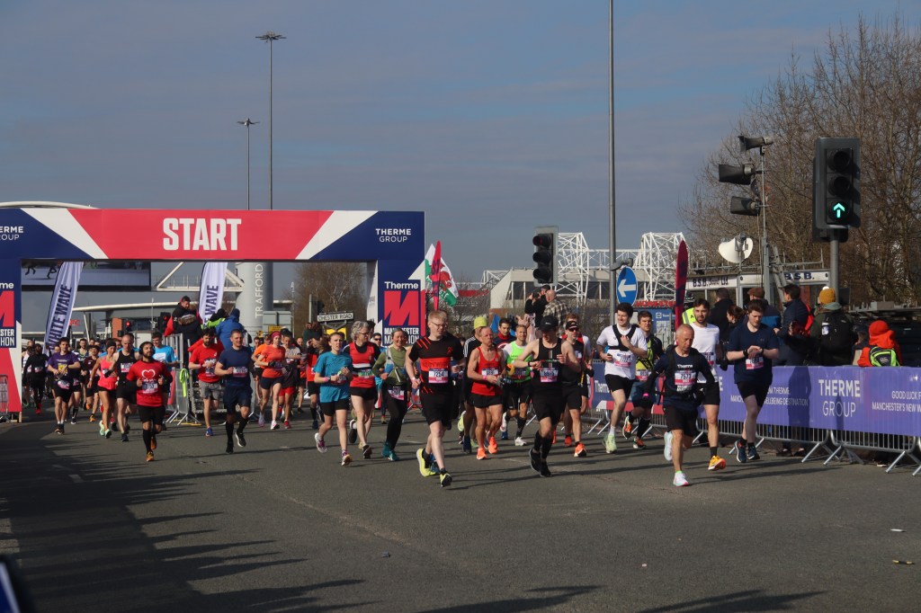
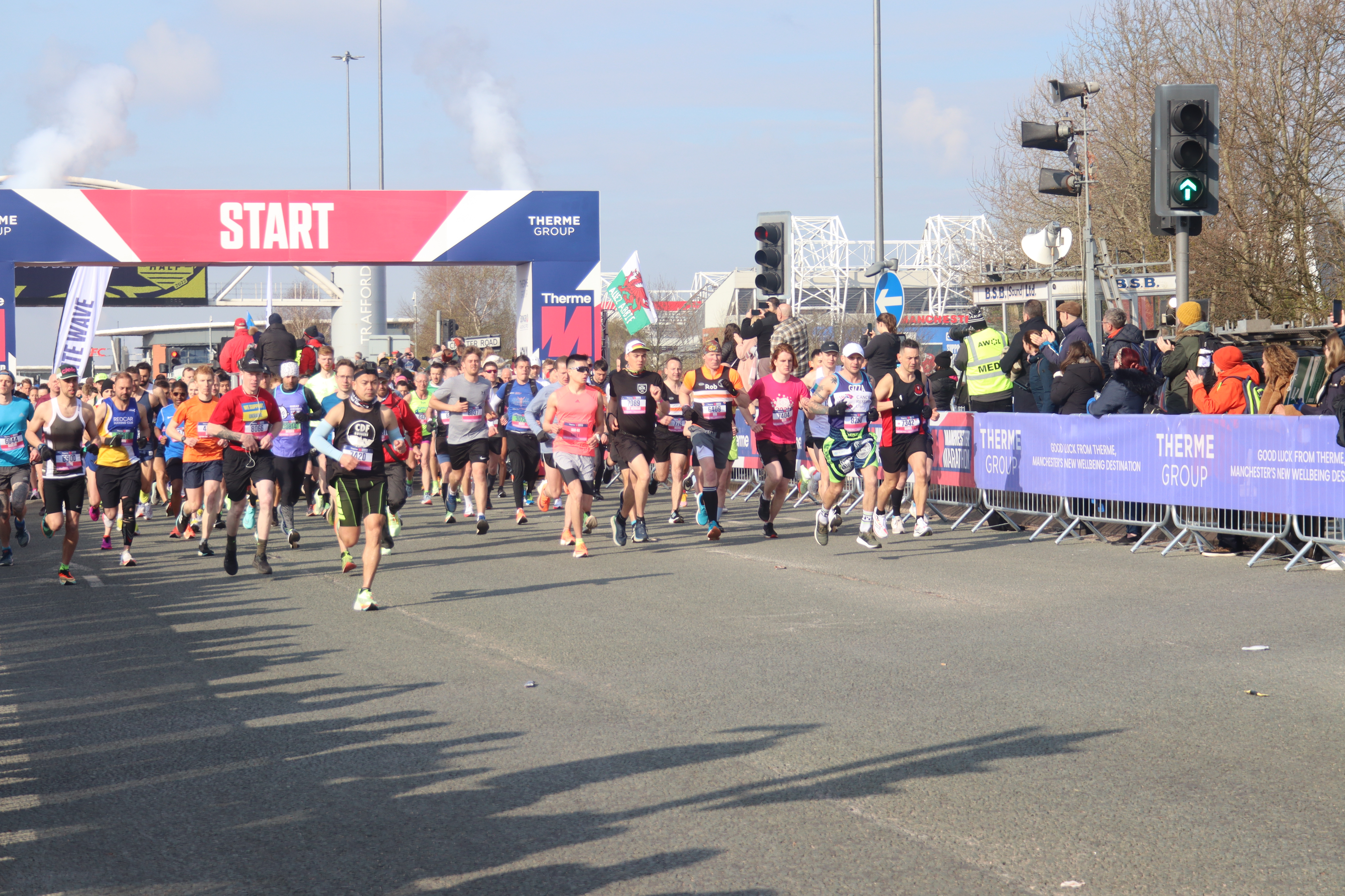
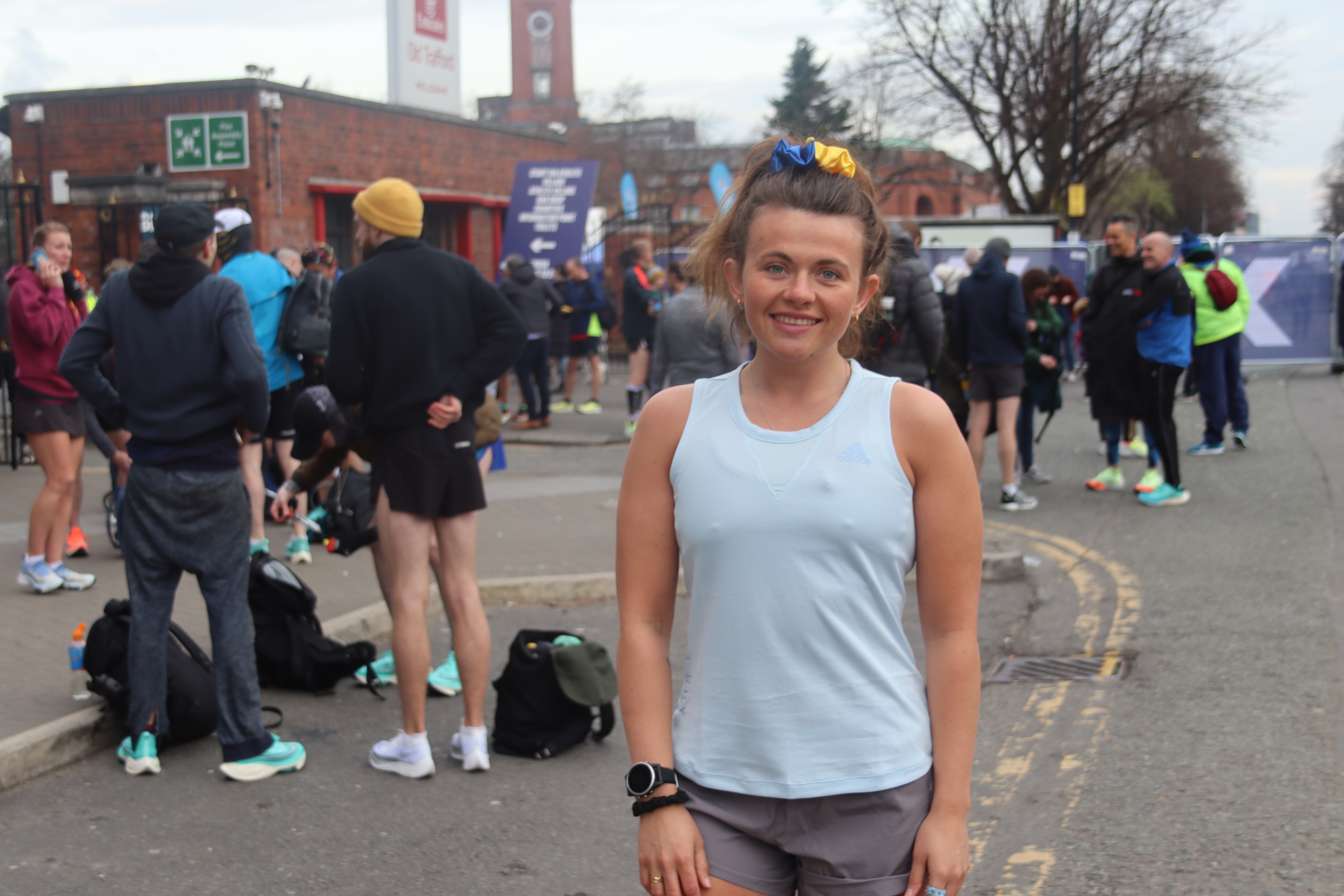
Within my progress for my interviews, so far I have spoken to three of the runners after the marathon to gain greater insight into each case study. I also had the opportunity to have a great chat with one of the senior marketing directors, Emma Sayers about the marathon, which has secured an interview with someone part of running the event. A great quote from her: “As an entire company, we’re really proud to have put this event on in a six-month turnover from our last marathon in October which is quite unheard of and incredible for us!”
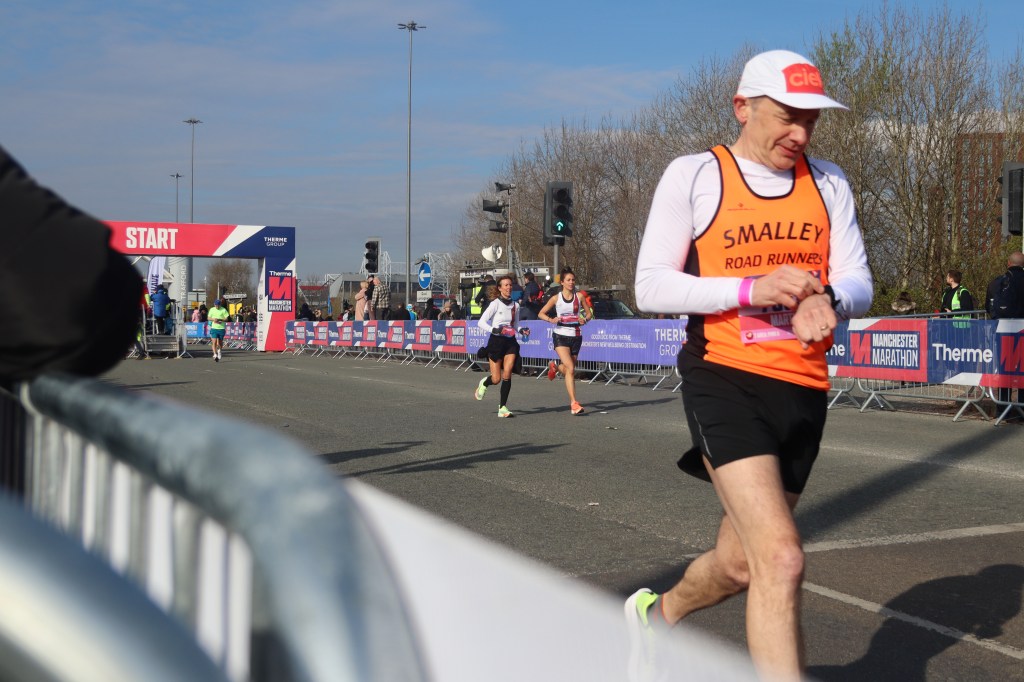
I feel very confident about the written portion of the article with just one more interview to complete. My story is centred around the rise in running since the pandemic, and how this marathon encourages these statistics to increase further. Looking at how I intend to conclude my story, I think it speaks for itself – where do these runners go from here? And this has been asked during interviews. Because I wasn’t able to stay till the end of the marathon, I will get some pictures of Andy, one of the runners based in Leeds, and focus on his plans post-marathon.
Here are some images (there are still more images I took that I want to include, so final decisions are still in the works). Again, without any edits to fix lighting, cropping, colour etc. The last image is of Isobel Sayers one of the runners (no she’s not related to the marketing director haha).
However, I didn’t want him to be the center piece. As I felt that I did not include an intimate portrait of Amelia, I decided that I would also not include an intimate portrait of David despite having one.
I realised, as I was embedding images into my story, that some pictures I wanted to include did not suit the narrative.
For example, another reason why I did not use this picture of David is because his clothing was completely different to what he was wearing in the other pictures, and I wanted to narrate the story as a single event. If I had included this picture it would possibly confuse the reader.
I like this picture because of how intimate it is. It also shows David’s micro-expressions on his face, which really gives the feeling of how exhausted he is. The slight downturned eyebrows also show him slightly disgruntled, perhaps oppressed by the heat.
I didn’t like the picture because, like the other portraits I have taken of Amelia, I realised that the eyes are not on show.
I think eyes are very important to the identity of an individual, and so I felt the portrait wasn’t very good given the story I wanted to do.
In future, I would make sure my subject takes off their glasses or anything which is obstructing view to their eyes. Sometimes, this could look good. But I definitely felt I needed more pictures of Amelia without her sunglasses.
In this picture, the sunglasses add story to the image. You can see David in the reflection on his bike, leaning in to Amelia and listening intently to what she had to say about women in cycling. This is a subtle detail but works brilliantly.
Below are further pictures I considered but discarded as a result of positioning and photo allowance.
I did not like the positioning of David here, even though you could see his height and face which I wanted to include in the story to convey the concept of masculinity and opposing physical appearance to that of Amelia; a marked contrast.
Though I like the placement of the above picture, I was a little upset I could not include it because I was only allowed to include around 11 pictures and I already has so many that I wanted to use.
I like the atmosphere, conveyed by the dark-ish hue, intensified shadowing. I also like how Amelia is looking at David, that she is in centre placement and that David can also be seen. It’s a symbolic contrast of the idea of female and male riders confronting each other in the cycling world.
To improve the picture I could have included more of David’s head whilst allowing it to override the frame. I could also correct the colour better so it is less blue-ish.
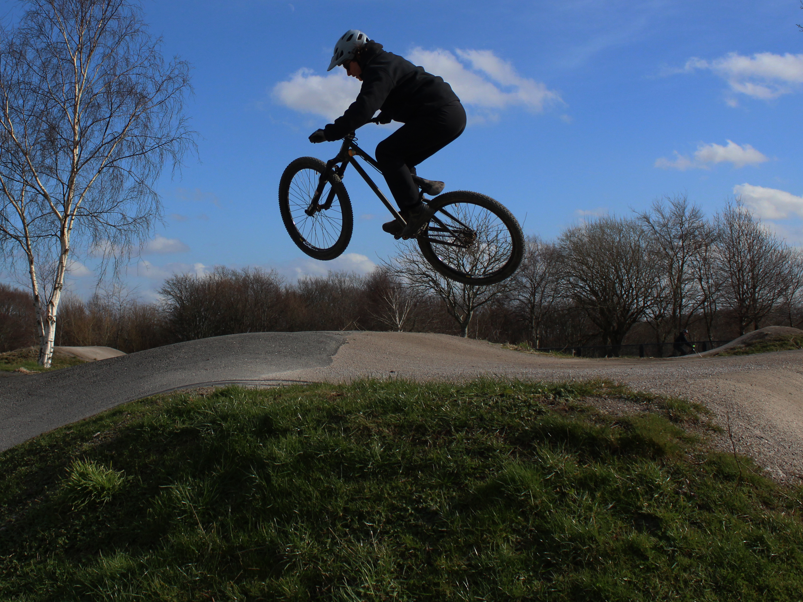
In the pictures below, I framed the subject by cropping her into the centre, lower third of the frame.
At first, I thought that the sky would show that she is high in the air and give a more ‘majestic’ feel to the picture, sort of wondrous and interesting with the blue-hued background of the sky.
‘SKY’
I then decided to crop the subject so that her body would be in the center, upper third of the grid.
Here, less of the sky and more of the ground can be seen. This gives an idea to the viewer how high up in the air the jump is, and provides some more context and understanding to the picture.
Perhaps the actual framing itself shows she is high up as she is at the top of the picture, rather than at the bottom. It also signifies her importance.
‘SAND’
I decided that I would stick with the second picture as I felt that it was more reflective of how high the subject is. It also allows you to see her first when scrolling down a website such as Medium, as opposed to seeing a sky and then the rider at the bottom last.
‘CHEEKY’
As I wanted to show the subject leaving the grounds, I paid attention to the positioning again and the idea of creating distance in a picture.
This is why I wanted more of the ground covering up the picture, to show she is far away from me.
Secondly, I positioned her in the left side of the grid to show her moving ‘out’ of the picture and environment.
I am not sure if this works quite as well as I want to but I am continuing to experiment and come to an understanding by gathering opinions and research online.
This time, I took pictures of a variety of subjects. I included inanimate objects such as tools in case I wished to include these in my finished project.
I dislike the way I edited this picture. I noticed that I really enjoyed viewing pictures with a lot of emotion. The consistent effective theme was that they were starkly contrasted, with very visible colour. Yet, I had a habit of reducing contrast in my pictures.
I was doing this because the darkness of the inside of the shop was incredibly difficult to work with.
I decided that I would keep some of the originals as they were and reduce the red hue in them.
Cropped to 4:3 and framed centrally, this picture would be fairly good as it is.David Matjas, strained by the heat
I like the emotion conveyed here. I have been trying to take more up-close pictures to show the subtle details in facial emotion. As I think I am naturally good at framing pictures, I tried to focus on my weaknesses by reflecting on the editing and colour. I increased the contrast and slightly brightened the picture. I liked the result.
As the picture was taken outside, there was the advantage of not having to deal with changing the colour balance as much, which I was thankful for.
Tools in depth
I took a picture of something inanimate to change the subject matter and how I approached it. I tried to create depth of field and make a boring subject matter look more interesting. I experimented with angles, which I enjoy doing.
I felt this came out very well and realised that inanimate objects were better to take pictures of for a novice when it came to dark lighting.
Amelia Di-Clemente fixing a customer’s handlebars
After capturing pictures of tools, I went back to focusing on humans as a subject matter. I tried to use a similar technique of angling, by taking pictures in strange positions.
I wanted to take a shot of Di-Clemente’s hands as she was fixing a customer’s bike. However, I wanted to keep her face, the shop logo, and the bars in the picture.
I achieved framing all these by lying down on the floor and taking a picture. This created an interesting visual and made the picture come across very intimate, and makes the viewer feel passive in their perception of the image.
Editing the picture, I rotated the image 90 degrees, and heightened the contrast and brightness massively.
The glimmers of lighting in her teeth, nose,eyes, on the latex gloves and handlebars, create a connection and make the picture more interesting.


You must be logged in to post a comment.